Schuyler’s Search for a Hybrid Reader’s Bible
Somewhere between the perfect Reference Bible and the purest Reader’s Bible, is there a sweet spot that balances immersive reading and verse-by-verse navigation?
Video is not my strong suit, but to accompany the feature article, I’ve created a brief explainer to help readers visualize the way the numbering system of the Treveris works.

1.
NOTHING IS PRECIOUS
“Are you that Mark Bertrand?”
It doesn’t happen often, but when I’m recognized in public it’s always for the same reason. Not my novels, I’m afraid. No, it’s the Bible. Someone who’s read my writing on Bible design will overhear my name, or spot me speaking in a different context, then work up the courage to ask the question. Often, the tone signals how improbable it seems. Surely this isn’t the same guy, the one who got them hooked on high-end Bibles. But when I admit that, yes, I am that Mark Bertrand, what usually happens next is this: they show off whatever fancy edition of the Bible they happen to be carrying.
These show-and-tells are much more interesting than they used to be. Ten years ago, there was nothing you could show me that I hadn’t seen before. The proliferation of beautiful, fascinating, and unexpected editions since then—not to mention all the new rebinding outfits—means that there’s more than I can keep up with. If you love the Scriptures and have an interest in good design, this is a great time to be alive.
Even so, when I encounter readers in the wild, the odds are good that the Bible they show off will be a Schuyler.
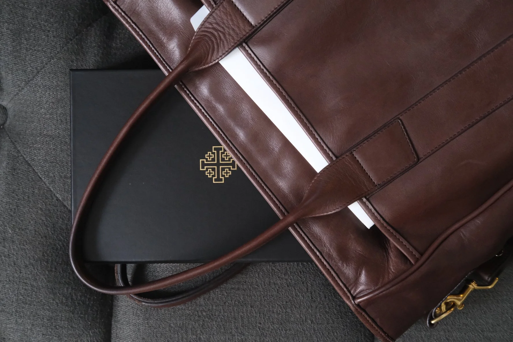
Do’s and Don’ts: I know a seminary professor who carries his Schuyler Bible around in its protective box (illustrated above). Totally understandable—but please don’t. Instead, take a risk and embrace the patina (below).
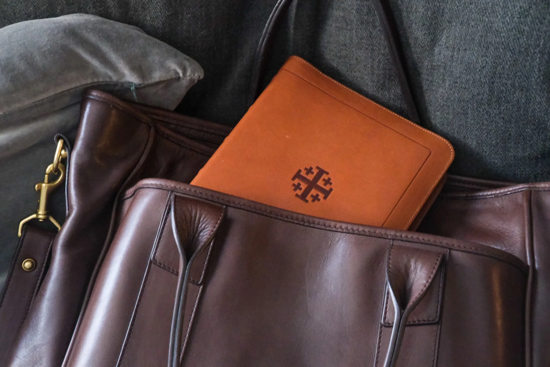
My favorite example: A seminary professor reached into his backpack to show me his everyday Bible. I expected something raggedy and worn. Instead, he produced a battered black box with the familiar Jerusalem cross, lifting the lid on a pristine-looking Schuyler Quentel. (Pristine because the professor was fastidious and the goatskin cover hard-wearing, not because the thing hadn’t been used.) I chided him for keeping the Quentel in its box, but I understood the impulse. It was a precious object to him, inside and out.
My wife has a rule for the Bertrand household: “Nothing is precious.” Is there a new stain on the leather couch? A ring from the glass left on the marble counter? I’m not allowed to mourn the damage, because nothing is precious. Everything is meant to be used, and any damage done is part of the patina. In theory, I agree. I do struggle, though, to apply the maxim to books of any kind, so when it comes to the Bible I have nothing but respect for the protective impulse. You should try to overcome it, though. Some things get better with age.
When it comes to Bible craftsmanship, a Schuyler sums up best practices. We all have our preferences. I’m not saying a Schuyler will tick every box for every reader. What I am saying is this: with a Bible like this, every detail has been considered. From the design details to the paper spec, from the binding to the leather cover, a choice has been made, a vote in favor of quality. You’ll pay a lot for one of these—the Treveris edition, for example, runs from $235 to $260 retail and the Stridon ranges from $225 to $265—and you’ll get your money’s worth. Schuylers are made from start to finish by people who are paying attention.
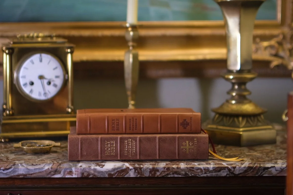
Above: Two editions from Schuyler—the Treveris (above) and the Stridon (below).
In the past, I have said there is a boring consistency to Schuyler Bibles. They just keep churning out well-made, tastefully designed books. These days, though, there is nothing boring about it: Schuyler is bringing out interesting colors and unique hides. Some are not to my liking, others very much are. The point is, they are not playing it safe. One thing they’re still doing, though, is listening. Schuyler fans aren’t shy when it comes to saying what they want to see, and the company remains responsive.
I’m one of those fans. If you’ve read anything I’ve written, you already know that. But what excites me most is not great paper, great printing, or great binding. What excites me most isn’t limp goatskin in a rainbow of colors. Don’t get me wrong: All of these do excite me. What matters most to me, though, is design. I will choose a well-designed $20 edition over a $200 copycat every time. I don’t care if its cheap or expensive; I care that it’s good.
For this reason, the best Schuyler in the lineup, if you ask me, is the Schuyler Treveris. I’m going to tell you why, but bear with me: This will take a lot of explaining.
2.
BRAVE NEW FORMATS (REDUX)
Let’s start with some recent history. Over the past two decades of book design, I can make a strong case for the emergence of at least two new types of Bible, distinct formats that look to have staying power. Let’s label them Journaling Bibles and Reader’s Bibles. (Perhaps we should add Illustrated Bibles, since we’ve seen a proliferation of these in recent years, but to my mind this counts more as the reinvigoration of an old format than the birth of a new. Anyway, I’ve written more about this here: “Brave New Formats: Genres, Part 3.”)
Since a Journaling Bible is basically a traditional wide-margin on steroids, you create one by a process of addition, widening the margins or adding entire blank pages interleaved with the text. By contrast, the Reader’s Bible is optimized for an immersive reading experience, which is achieved by means of subtraction. You remove as many distractions as you can from the page. (The Treveris, of course, is a Reader’s Bible—but it’s a particular kind of Reader’s Bible. We’ll get to that.)
What makes both of these new genres intriguing to me is that each is designed with a specific use case in mind. Each began with a goal—note-taking or deep reading—and the resulting design choices aim at achieving that goal. The Bibles I grew up with were just the opposite. They had picked up features over time the way barnacles build up on the hull of a ship. If there was any goal to speak of, it was to be all things to all men. The notion of designing a Bible with a single purpose in mind, though not entirely unheard of, ran contrary to traditional wisdom. And a lot of smart people, insiders in the industry, used to tell me that every example of such an endeavor had ended in failure (which is why so few wanted to try).
So what changed?
I’ve nurtured a theory since the early days of e-books, back when anxiety about the demise of printed books ran rampant, that, paradoxically, this new technology might represent an opportunity. In the old days, before you could pull up the text of Scripture on your smart phone complete with cross references, commentary, and textual tools, those barnacle-laden Bibles made a lot of sense. Readers wanted every possible option packed onto the printed page. In the brave new world of digital Bibles, though, what you want from a printed edition has changed. Print is analog, and lends itself to analog uses. Both deep reading and copious annotation are tactile experiences, so it makes sense that both Reader’s Bibles and Journaling Bibles would emerge right now.
“Sure,” you’re thinking. “Hipsters love printed books like they love vinyl records. It’s just a trend, though. There’s no future in it.”
I beg to differ. Admittedly, some of the attraction may be fueled by nostalgia. We have seen a revival of interest in analog media, so curiosity about printed Bibles (especially these novel, boutique editions) makes commercial sense. Will we keep doing watercolors in the margin of our Bibles, though—or griping about the inclusion of verse numbers—once the trend dies down? Only time will tell. I’m optimistic, though. For good reason.
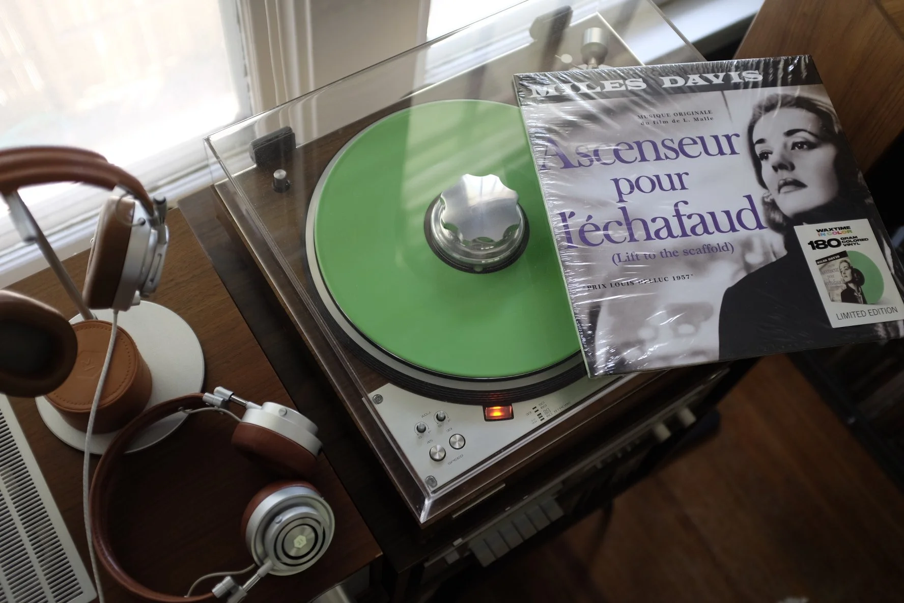
Yes, I’ve succumbed to the lure of vinyl, but I don’t kid myself that the records spinning on my turntable produce better-than-digital sound. The fussiness of the process adds something, though.
A Reader’s Bible isn’t the scriptural equivalent of a film camera or a vinyl record. You don’t need to wax nostalgic to appreciate one. Reading a printed book is objectively better than the digital experience. It is discursively better. Print, as a technology, solves certain problems better than screens do. When I fire up the turntable and drop the needle on the Miles Davis soundtrack to Elevator to the Gallows (above), I don’t kid myself that the sound coming out of my speakers is better than anything I could stream hi-res. The scratch and pop serve as a sonic Instagram filter. It’s cool, but it’s not objectively better. But I am convinced that when I swipe away from the ESV app on my phone and pick up the Schuyler Treveris, the equation is reversed. The app is cool, but it’s not objectively better—at least, not for the activity I care about most: immersive reading.

If that kind of reading is your goal, then losing yourself in a printed book is better than scrolling through an e-book. The tactile nature of the act supports longer, deeper reading. If that kind of reading is your goal, a printed book optimized for deep reading is better than a jack-of-all-trades, too.
By the way, I would make the same case for Journaling Bibles. I don’t draw in my Bible for the simple reason that my artistic skills stopped developing in sixth grade, so I’m more likely to use a Journaling Bible for note taking than trying my hand at monkish illumination. When you write by hand, though, you engage physically with the text, interacting with mind and memory in ways that the glowing screen does not. Yes, I realize you can now write by hand on a screen. That’s better, but I still think paper rules. As I write this, I just spent three hours on a jet with a hardcover in my lap, feverishly underlining, scribbling interjections in the tight margins. I must have looked crazy to my fellow passengers, but when I read pen-in-hand I devour the text in a way I’ve never experienced with digital tools.
I could go on, but you get the point. To me, these new genres suggest a future for printed Bibles that has nothing to do with hipster suspicion of digital tech. If anything, they reveal the fact that the potential of print as a technology is far from exhausted.
If the Treveris is the best Schuyler you can buy—and I think it is—the reason is that it showcases the technical capability of printed Bibles in a fascinating way. To explain this, we need to start with the fact that the Treveris was never intended to be a Reader’s Bible, at least not in the purest sense. The objective was to create a hybrid model.
3.
THE HYBRID EXPLAINED
What do I mean by hybrid? Forgive the following clichés. The Treveris wants to be the best of both worlds. The Treveris wants to have its cake and eat it, too. While it does not aspire to be all things to all men, the Treveris wants to be two different things—namely, a Bible you can use for deep reading … and a Bible you can look things up in. That, my friends, is what the dream of the hybrid Reader’s Bible is all about. The introduction to the Treveris explains it this way:
The single column layout, along with the removal of verse numbers from the text body, is meant to create an immersive reading experience, in which the reader is able to directly encounter the powerful story of Scripture without external commentary. However, we understand that chapter and verse numbers, as well as chapter headers, are helpful for Bible study or in contexts where the Bible is read communally. To aid readers in locating specific text, we have included all chapter and verse numbers in the margin. While the verse numbers may not be directly next to its corresponding verse, context clues such as punctuation make it easy and intuitive to find where a new verse begins. Combining these two approaches, we have created what we hope is a pleasing hybrid: a Bible with clear, uncluttered text that also offers practical tools for navigation.
The first successful attempt at a Reader’s Bible was also a hybrid. The single-volume ESV Reader’s Bible removed the verse numbers from its paragraphed text, which made immersive reading a joy. At the same time, every page bore a header giving the name of the book along with chapter and verse. You could use it for deep reading, and you could use it for looking things up. It was, however, much better at the first job than the second.
To bring the hybrid concept into sharper focus, we need another metaphor. Picture a sailing ship overladen with cargo, sitting low in the water. It’s been provisioned for a round-the-world journey, equipped for every conceivable adventure. This ship is ready for anything … except for a race. It will take you anywhere eventually, but nowhere fast. Reader, that is what the Bible we inherited was like.
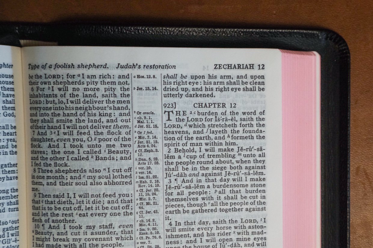
Above: The first Bible I ever purchased from R. L. Allan exemplifies the ‘sailing ship’ concept, a layout that packs as many features as possible onto the page, because you never know what you’ll need. Verse-by-verse, cross-references, section headings—even self-pronouncing spelling of difficult words like … Jerusalem, Israel, and Judah.
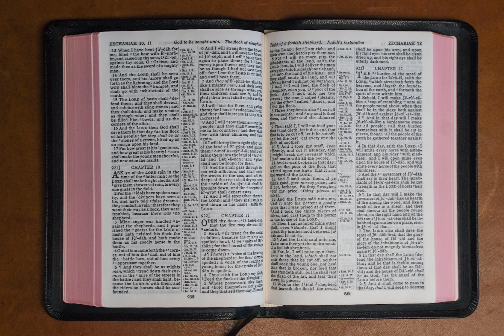
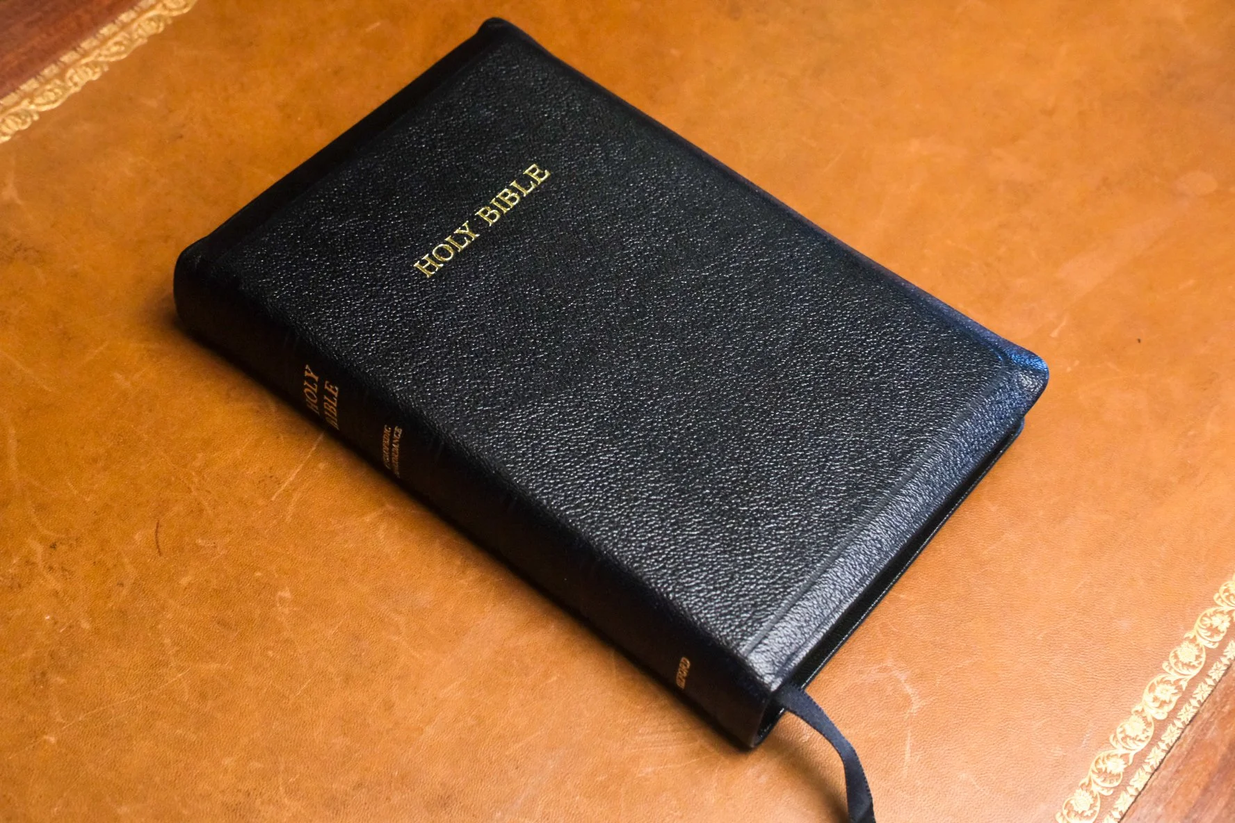
That Bible was meant to be your one and only, the Bible you’d use from cradle to grave. You would read it before bed, leaf through it during morning devotions, take it with you to church to sift through in the pews. You would study the Scriptures with it, too, turning back and forth as the cross references carried you, scanning the concordance and tracing your finger over the maps. You would record milestones in its front cover, preserve letters, programs, scraps of paper within its pages. You might press flowers in it or forget a paper clip that would leave rust stains on the page when it finally fell free. That Bible would crumble in your hands before you dreamed of replacing it. Like that galleon circumnavigating the globe, it was ready for anything. As a result, it could not afford to leave anything behind.

Everything is streamlined in a Reader’s Bible like the Treveris (above). While the beautiful Allan above looks like a book you look things up in, this is clearly a book meant for reading.
By contrast, the Reader’s Bible is a racing yacht. It has one mission, and to achieve this you must lighten the load. The one non-negotiable is the text itself. Apart from that, you can throw everything overboard.
Or can you? That’s been the question since the very beginning. How much can a Reader’s Bible hold onto and still qualify for the label? The question has been answered in a variety of ways, some more convincing than others. R. L. Allan, for example, once published what was called a Reader’s Bible, even though it was simply a Reference Bible with enlarged print. True enough, bumping up the font size made for easier reading, but most of us felt that earning the title would take more than that. We did not agree on how much more.
If larger print makes text more readable, so does paragraphed text. The more the Bible looks like a book meant for reading, the more readable it becomes. But is there a difference between being more readable and being a Reader’s Bible? I think so. Earlier, I said the Treveris is a Reader’s Bible, but not in the purest sense. That’s because the purest expression of the Reader’s Bible throws everything overboard apart from the text. The Treveris holds back. Like the ESV Reader’s Bible, it wants to serve two purposes at once. The purest examples don’t do this because they want to do one thing as well as it can be done.
Bibliotheca is the gold standard here. That groundbreaking publication proved that a sea change had occurred. Traditional wisdom said that no one wanted a multi-volume edition of the Bible, certainly not one featuring a translation nobody was using without chapter and verse numbers, nothing but plain text. The success of Bibliotheca didn’t just change minds. It convinced some people they had never believed in the traditional wisdom to begin with (including a few who’d cited it to me). Like Alexander making a beeline for Darius, Bibliotheca saw the prize and spared nothing to get there. The ESV Six-Volume Reader’s Bible, Tyndale’s Immerse, and the other examples following in Bibliotheca’s wake made similar choices.
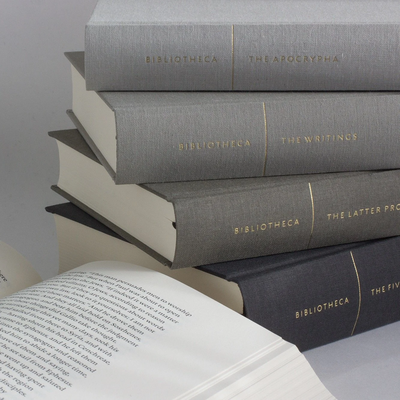
One of the most significant projects in modern Bible publishing, Bibliotheca proved there was a public appetite for good design—even when it breaks from tradition.
The more you throw overboard, the better the vessel serves its primary task. But is there a danger of going too far? After all, holding onto at least some of the extras opens up a possibility that the same volume might serve a secondary purpose. Start thinking like this, and you will understand where the hybrid urge comes from.
Suppose it’s possible for chapter and verse can be discreetly retained. Suppose they can be re-imagined somehow, configured to get out of the way but still preserves their essential function. Suppose you can streamline enough to get the Reader’s Bible seal of approval, but still work in a clutch when it comes to finding a particular passage? If such a thing is possible, the resulting hybrid could be used for immersive reading while still being practical for church and classroom.

4.
A PASSION FOR JOTS & TITTLES
I could not have written about Bible design for more than two decades without a passion for jots and tittles. For plenty of people, this analysis would be too granular. If you’re still with me, though, you’re not one of those people. You have a tolerance for minutiae. It may worry your friends or your spouse. Since you have put up with my wordiness up to this point, indulge me a bit farther.
As I’ve said, the ESV Reader’s Bible was an attempt at a hybrid. Keeping that header made this much clear. “I am mainly for reading,” it said, “but in a pinch you can use this chapter and verse range to guesstimate the location of a verse.” I am a huge fan of this format. Every new member of my church receives a copy, and over the years they have reported surprising results. They read this Bible differently: for longer periods, covering more text. They lose themselves in it, which is the point. But part of the reason they lose themselves is because the ESV Reader’s Bible’s vestigial wayfinding apparatus does not work very well. This is a feature, not a bug. Yet it is a limitation.
Put it like this: You can orient with that header, but you cannot navigate.
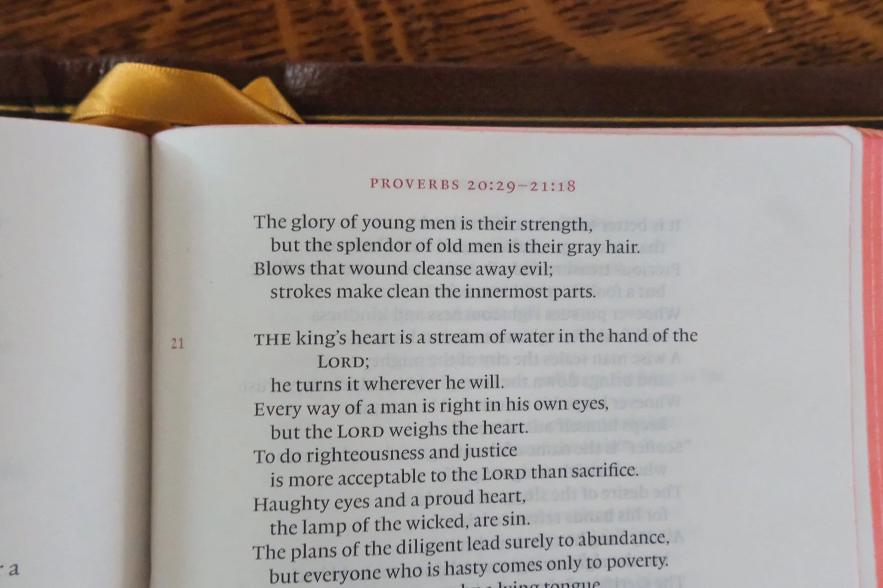
The header at the top of every page in the ESV Reader’s Bible gives you enough information to orient yourself—but without verse numbers in the text, you can’t really navigate.
Verse numbers serve a useful purpose—two, in fact. With verse numbers, you can look up specific passages with ease. But numbers also serve as signposts in a larger sense. They don’t just let you find a particular destination, they also tell you where you are. Think of them like the biblical equivalent of GPS. The map on your screen can take you to an specific location. That’s its primarily purpose. But you can also just drive with no destination in mind, and GPS still shows where you are on the map. So, navigation and orientation. That’s what I mean when I say the ESV Reader’s Bible can orient, but not navigate. You always know where you are, but you can’t be precise about your location.
“Well, yes,” you say. “That’s the sacrifice you make if you want a Reader’s Bible.”
Maybe so. The whole point of a hybrid is to hold out the possibility that you don’t have to compromise, or at least not entirely. The header in the ESV Reader’s Bible is like the donut spare that came with your car. You can’t drive quickly on that thing, and it’s nowhere near as good as a full-size spare, but at least you’re not stranded.
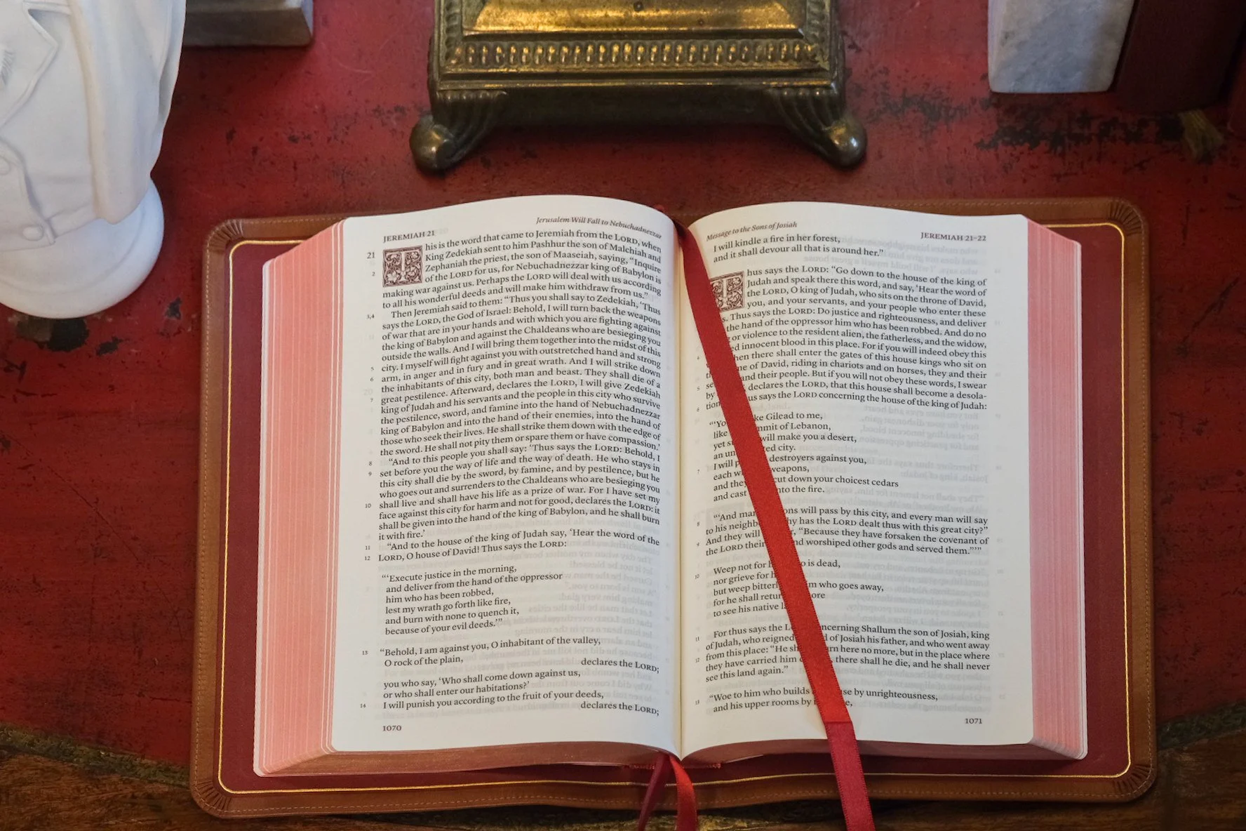
Then along comes the Schuyler Treveris to say that maybe you can have a spare that’s just as good as the original, or even better. Maybe you can enjoy that fully immersive reading experience, but also orient—and navigate—with the best of them. The Treveris achieves this by pulling one of my favorite design moves: adapting solutions from the past to meet new challenges. Specifically, it perfects an older method of pushing verse numbers out of the text without pushing them off the page. In designing the Treveris, Schuyler resurrected an experiment that goes back to the mid-twentieth century with the publication of the groundbreaking La Bible de Jérusalem (on which the Jerusalem Bible was based) and the New English Bible. And, as I recently discovered, it traces back farther than that.
5.
A NOT-SO-NOVEL IDEA
The history of Bible design is more complicated than you may realize. Since Robert Estienne introduced verse numbers as a feature of printed Bibles in the mid-sixteenth century, the verse-by-verse approach used in the Geneva Bible became the norm in English editions. The fact that verse-by-verse reigned for centuries testifies to its utility. By placing the number in superscript at the start of each verse, a reader without any prior familiarity can locate particular passages with ease. Even if it’s your first time holding a Bible, you can find any sentence in the Scriptures with relative ease. But Bibles weren’t formatted verse-by-verse just because it was useful. Once a design choice becomes ubiquitous, we stop thinking of it as a choice at all. Verse-by-verse formatting is like that. For a long time, that’s just how the Bible was. It’s what made the Bible look like the Bible—just as the thees and thous made it sound like the Bible. Both the King James translation and the verse-by-verse design had become inseparable from the Scriptures themselves. Designing the text any other way would have seemed unnatural, literally un-biblical.
Even the rise of paragraphed editions did not change the method as radically as it first appears. Side-by-side, modern paragraphed Bibles look a lot different than, say, a Scofield Bible of a century ago. But they still place numbers at the beginning of each verse; it’s just that the verses are now arranged in prose paragraphs. The numbers didn’t move; the verses did. Does this mean there is really no alternative? Once numbering is introduced, is there no way to separate it from the text? I don’t think so.
The fact is, there was nothing inevitable about verse-by-verse formatting. The Bible didn’t have to look this way. There were always alternatives, even as far back as the 1500s. The Treveris has retraced its steps to this historic fork in the road, then taken a different turn.
The solution is perfectly simple.
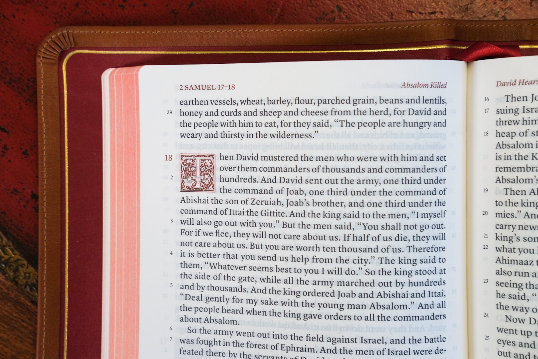
Instead of attaching the numbers to the start of each verse, the Treveris sets them in the margin. It’s not rocket science. Anyone familiar with critical editions of poetry, for example, will recognize this approach. To aid with citation, scholars have numbered the verses in many poetic works, but the critical apparatus is kept distinct from the author’s text. When your professor teaches Chaucer or Milton, the textbook provides the equivalent of chapter and verse. But you won’t find these mingled with the poetry. They’re in the margin where they belong.
Some printed Bibles followed the same convention.
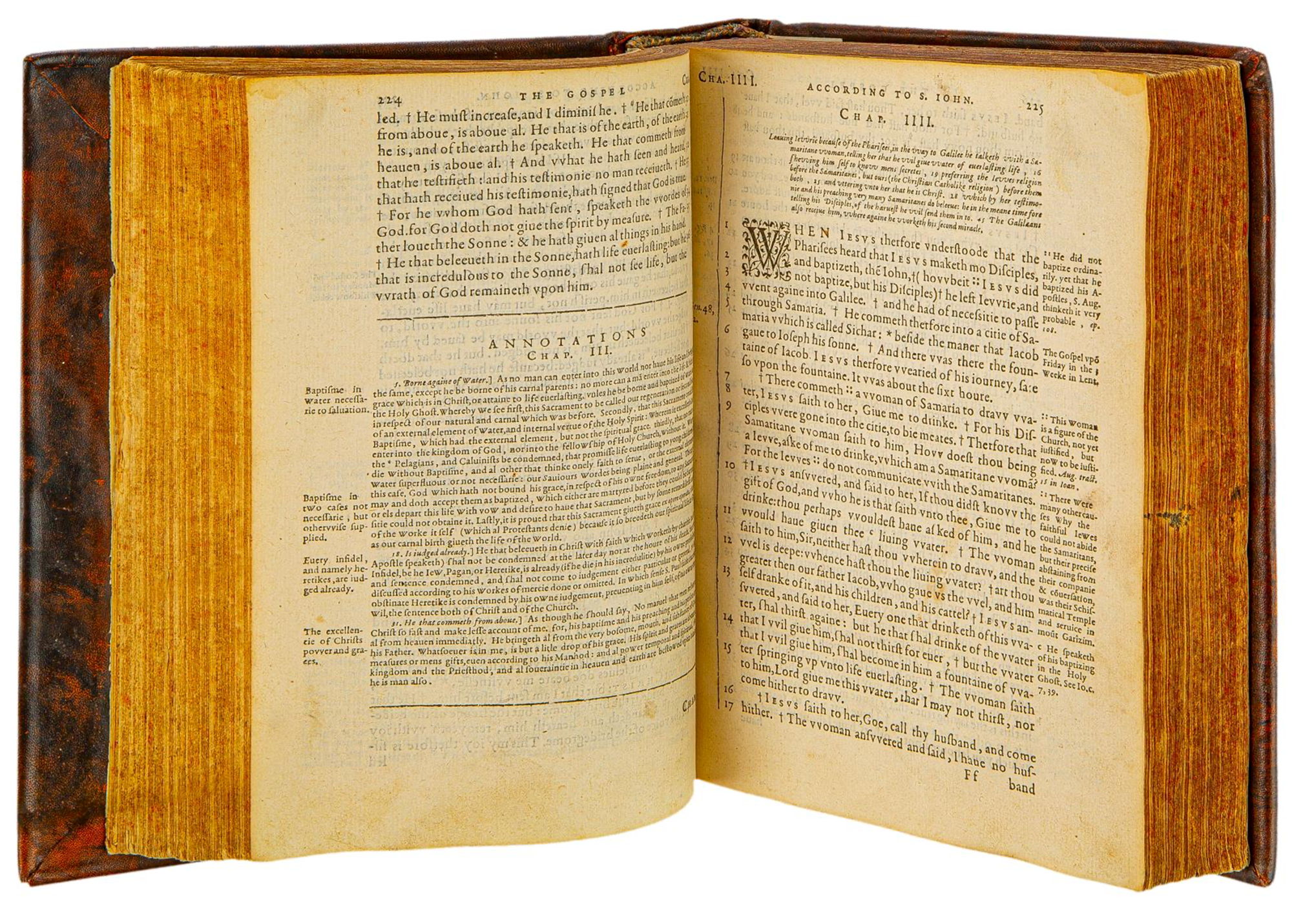
Above: The Rheims New Testament features verse numbers in the gutter (i.e., the inside margin). Like the Treveris, it also features decorative drop caps. The edition displayed at Museum of the Bible is the second printing from 1600. As the spread below illustrates, the verse numbers don’t exactly jump out at you.
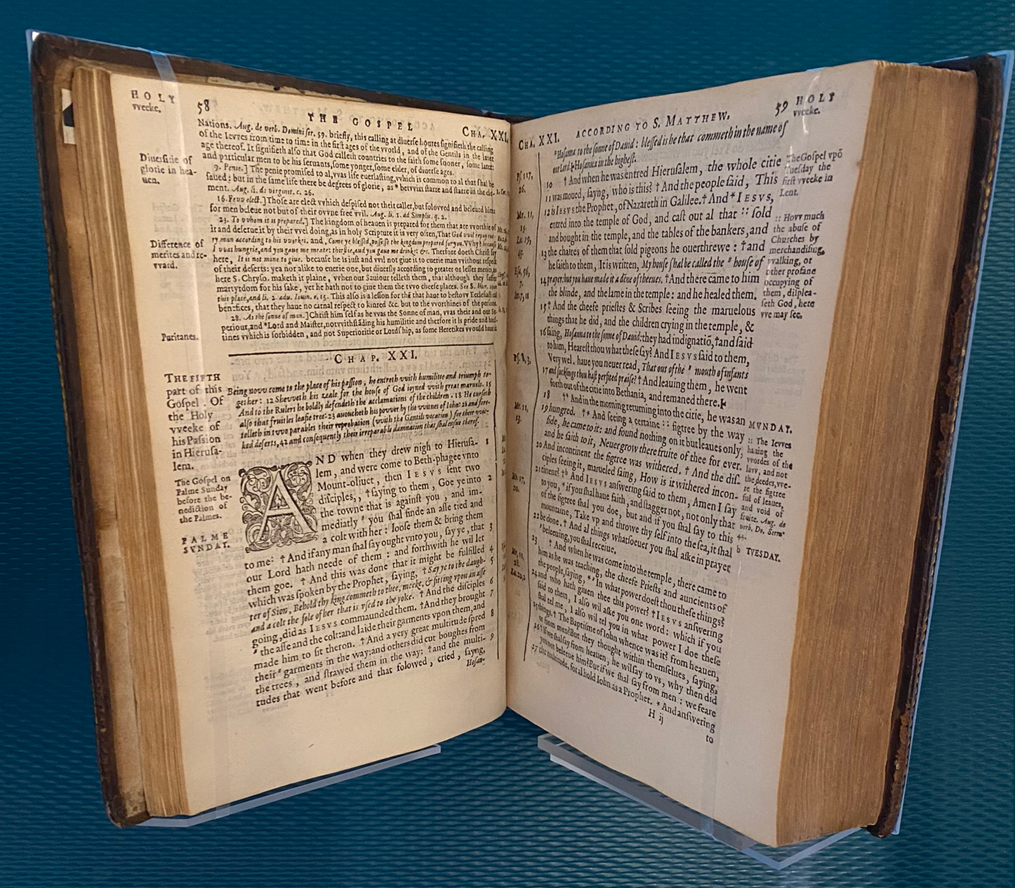
The earliest I have seen dates from 1582. On the fourth floor of Museum of the Bible in Washington, D.C., a copy of the first edition of the Rheims New Testament features a layout that looks surprisingly modern. The text is paragraphed, set in a single column, with verse numbers located in the inner margin, near the book’s gutter. Each number is in line with the start of its verse, but the actual break is indicated by a printer’s dagger. If you’re looking up a passage, you glance down the inner margin to the number you want, then scan across to the dagger. (There are asterisks in the text, too. These point readers to textual notes in the outer margin.) My heart raced when I spotted this New Testament under the glass. While the whole exhibition manifests design diversity, the Rheims was the only instance I found of verse numbers handled like this. “Are there more examples like this?” I asked one of the curators, hoping to uncover a rich vein. If there were, though, he hadn’t noticed. I suspect others do exist, and some print scholar may yet uncover them.
The significance should be obvious. Here, at the dawn of printed Bibles, there are features reminiscent of modern innovations. Which means, of course, that we haven’t innovated as much as we think. The Rheims New Testament is much rougher in execution than its modern equivalents, but the ideas are present, testifying to what might have been.
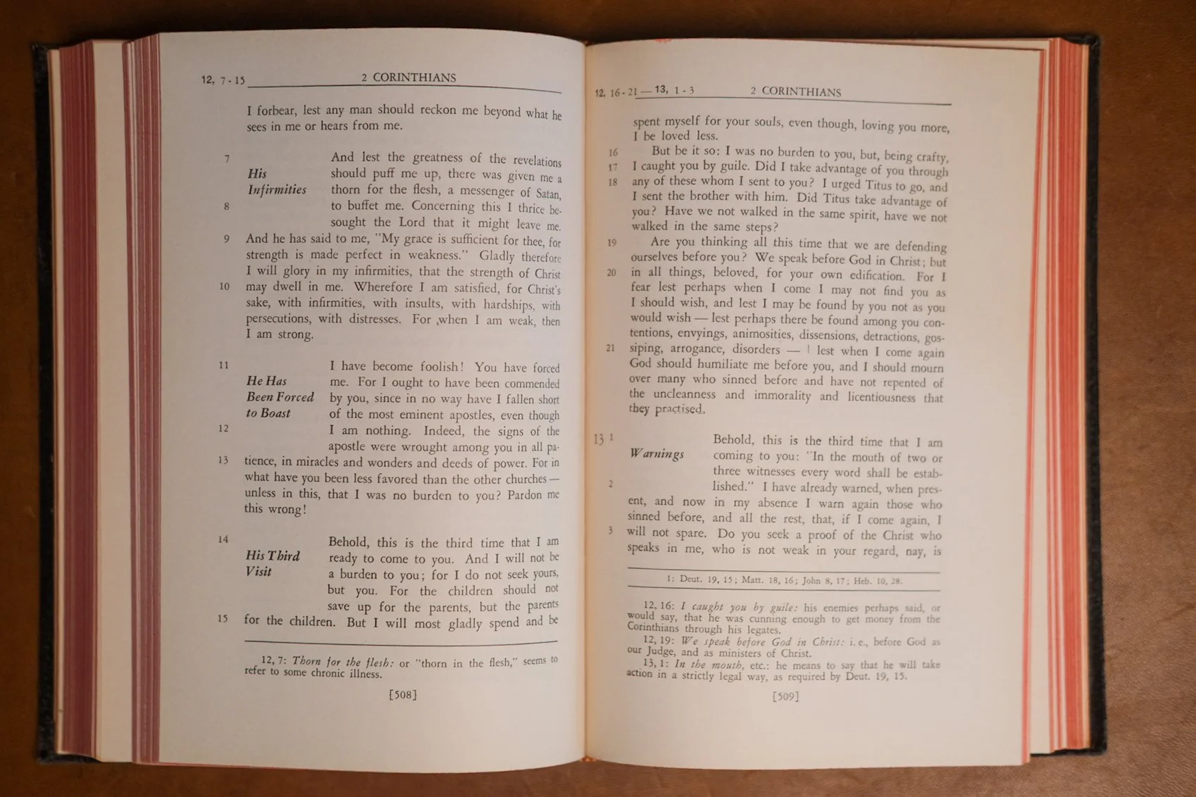
Roman Catholic Bibles, at least, seem to have kept the idea alive. This Confraternity New Testament from 1941 handles verse numbers the same way the Treveris does.
Before I came across the Rheims New Testament, I associated verse numbers in the margin with the New English Bible. In the mid-twentieth century, the NEB set out with a mission to make the Bible accessible to modern readers. There’s nothing groundbreaking in that: most new translations claim to enhance accessibility. In fact, if accessibility is your goal, then translating anew is the typical solution. What made the NEB noteworthy is that it didn’t stop there. The team understood that design choices impact usability, too.
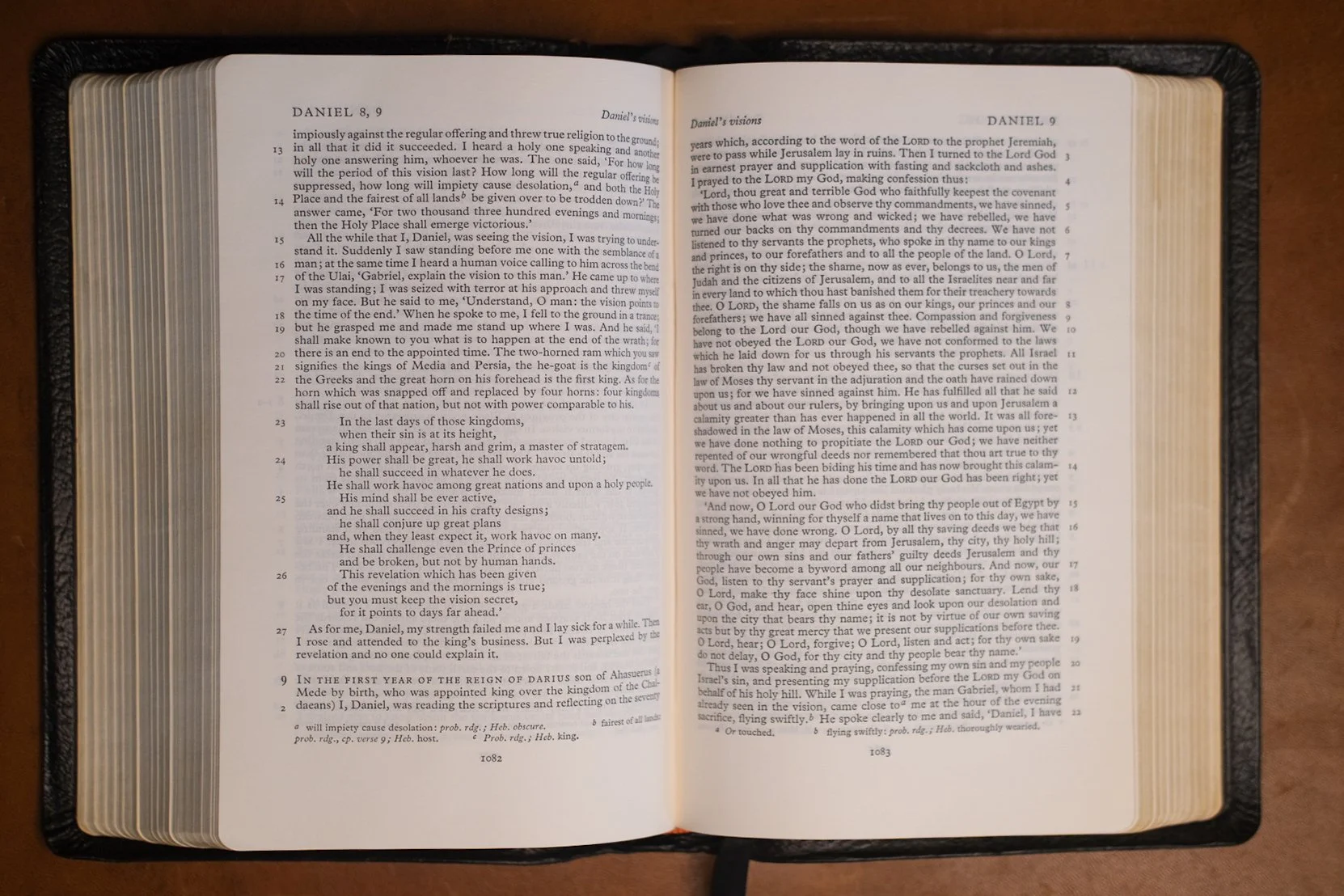
Above: The NEB layout locates verse numbers in the outer margin. Unfortunately, the type is a bit too small relative to the column width, which creates the impression of a densely packed page. The design for the New Testament (below), gets the balance better.
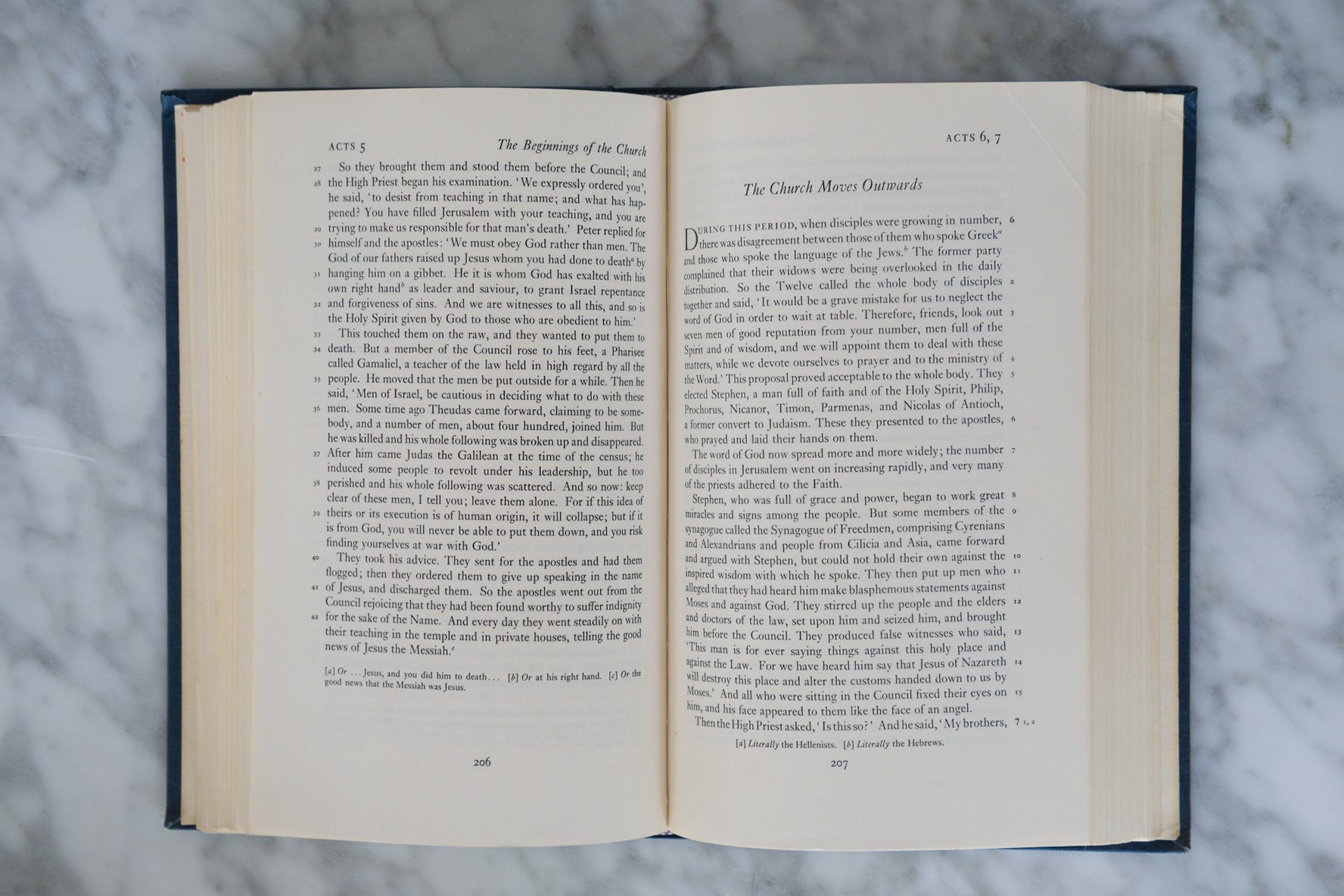
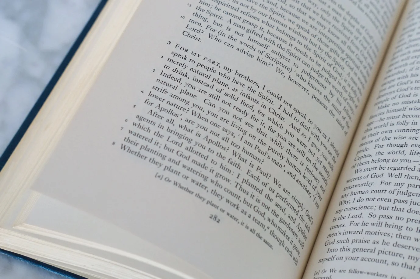
So they modeled their first editions on the type of prose works people were already accustomed to reading—novels. The text was paragraphed and set in a single column. The verse numbers were set in the margin “to avoid breaking the continuity of the text,” as Geoffrey Hunt from Oxford University Press later explained. This method served to “keep the text as ‘clean’ and modern in appearance as possible.” I don’t know whether the designers of the NEB or the contemporary Jerusalem Bible were directly inspired by the Rheims New Testament. There were certainly other examples to draw from (as the Confraternity NT pictured above attests). The idea is the same though, albeit with refinement.
For a start, the verse numbers in the NEB are not buried in the gutter. They’re in the outer margin, alternating from left to right as the pages turn. This makes them easier to spot compared to the Rheims, because your eye moves more naturally to the edge of the page. There are no daggers or asterisks to clutter the text, either. Frankly, there’s no need to mark the start of the verse so precisely. The breaks tend to fall where the punctuation does. Find a comma or a period, and that’s where the new verse begins. If there are multiple commas or periods, you may have to guess—but the method is surprisingly accurate.
The first time I held the original NEB in my hands, a sense of frustration overwhelmed me. Galahad might have felt the same thing if, returning empty-handed from his quest, he’d found the Grail at the back of a cupboard in Camelot’s kitchen. Everything I wanted in the Bible of the future had already been achieved … before I was born. What happened? How had we forgotten so quickly?
The fact is, the NEB’s design choices did catch on, but it took some time. Paragraphed text came first. Yet, unlike the NEB, paragraphed Bibles stuck with traditional double-column layouts (the format later editions of the NEB reverted back to). I was well into my quixotic adventures as a Bible design writer before viable single column settings broke the surface. When I held the firstfuits—Cambridge’s Clarion—in my hands pre-publication, it felt like an artifact from a more advanced future had broken into our timeline. Now we take single column Bibles for granted, forgetting just how recently they emerged. The reason it took so long for this feature to catch on is that the NEB itself was a flawed design.
You see, there is a fundamental tension in Bible design: the balance between the book and the page. Because there are so many words, the Bible is a big book. To make it manageable, designers set the type as small as they can without sacrificing legibility. The more words you fit on each line, the more words you fit on the page, and the more you fit on the page, the fewer pages you need. The problem is, tiny letters packed onto a long line are a challenge to read. Breaking the text into two columns helps, because it shortens line lengths. To make a single column text equally readable, you’d have to increase the size of the type—but then you’d fit fewer words on the page. This means that, to make the book manageable, you make compromises on the page. If instead you focus on a well-proportioned page, the size of the book balloons. A well-proportioned single column Bible is going to be chunkier than its double-column equivalent.
Simply put, the NEB got the balance wrong. The column is too wide, the text too small. The resulting page looks dense. Reading feels laborious. Despite this, the NEB is still a thick volume. The compromises on the page do not seem to have improved the book. As a result, when I began to advocate for single column Bibles, the NEB was often cited as evidence that this idea would never work. The column will always be too wide, I was told, and the text too small and the book too thick. (The layout of the NEB New Testament, unlike that of the complete Bible, gets the balance much closer to perfect—but then, it can afford to: by design, a New Testament contains far fewer pages, so the tendency toward a thicker book is not such an issue.) Single column was good in theory, people said, but unworkable in practice. This nugget was memory-holed as soon as Cambridge got the balance right. Design problems often seem impossible right up to the moment they are solved. Afterward the solution becomes common sense.
Today, paragraphed single column Bibles are still in the minority, but there are plenty to choose from. The NEB once looked futuristic; now that we’ve caught up, we can tell it’s only mid-century modern. Its innovations have gone mainstream, and in the process they’ve been improved. But it wasn’t until the Treveris that the numbering method was perfected.
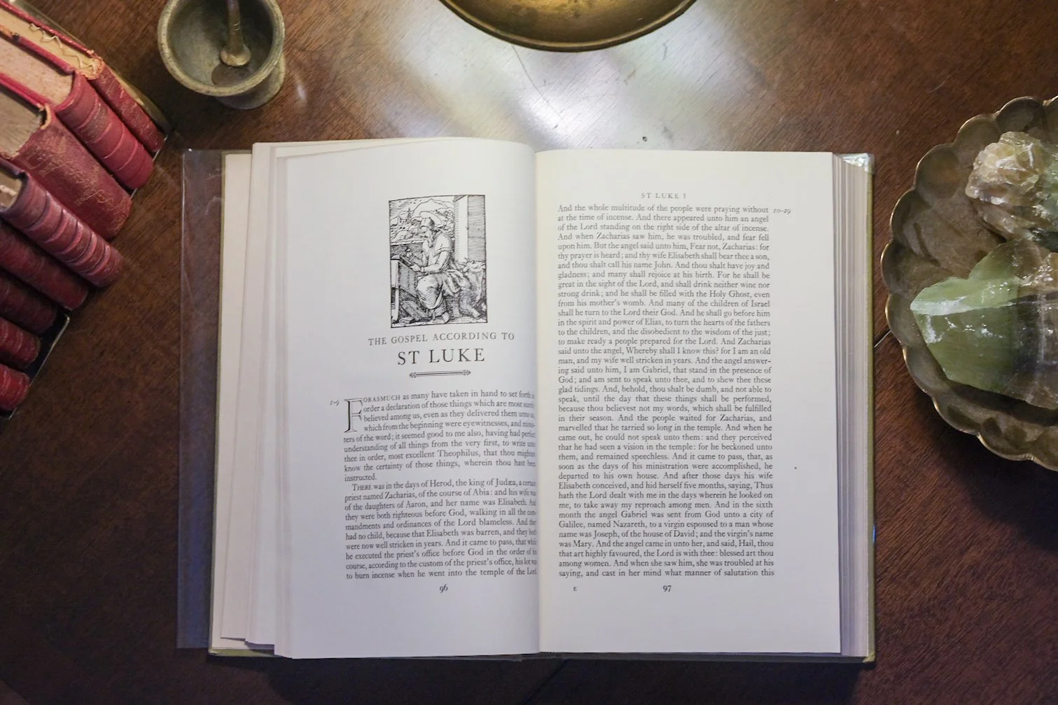
Another fascinating example: The Nonesuch Bible (1960), which takes a very minimalist approach to verse numbering by placing a range in the margin. Above, you see verses 1-9 on the left and verses 10-29 on the right. Good luck telling which is which—but the result is certainly beautiful.
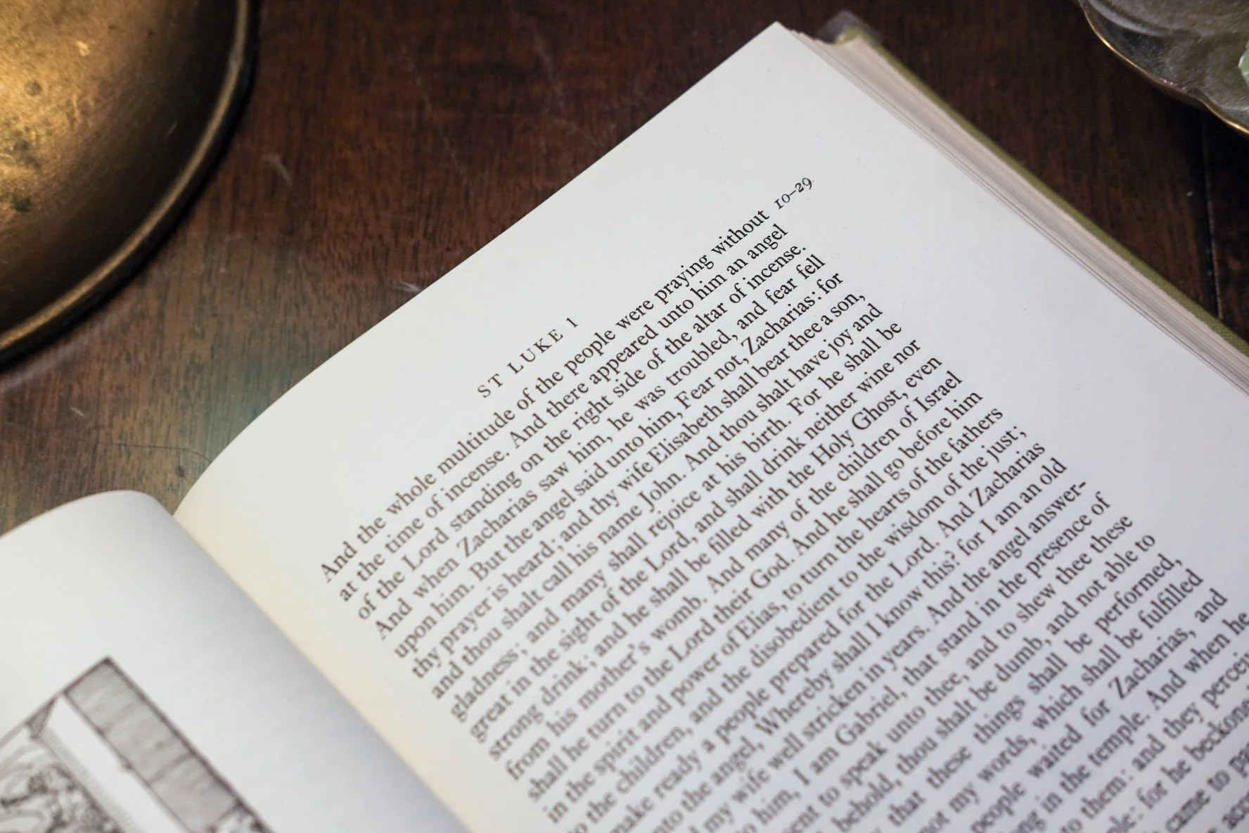
Not that previous attempts hadn’t been made. One I admired was The Message Remix, a hardcover edition of Eugene Peterson’s paraphrase. Instead of listing every number in the margin, the Message Remix gives a marginal verse range at the start of a paragraph. For example, if a paragraph begins with verse 4 and ends with verse 14, the Message Remix prints “4-14” in the margin. Calling this an improvement, I admit, depends on your perspective. If you’re trying to find verse 9, this method makes the job more difficult. Still, I like it, because it keeps the margin cleaner while providing a general orientation. Here, the designers may have taken inspiration from another mid-century marvel, the Nonesuch Bible (pictured above), a three-volume, paragraphed, single-column KJV that was giving off Bibliotheca vibes all the way back in the early 1960s. This beautifully-produced edition cites a verse range in the outer margin at the start of each long paragraph. Though useless for citation, the method oozes elegance from every pore.

When you don’t have to print the entire Bible in one volume, you can give the text on each page room to breathe. These examples from the 1960s—the NEB New Testament and the Nonesuch Bible—take full advantage of that fact.
Interesting as I find these experiments, they’re reminiscent of the ESV Reader’s Bible when it comes to what they sacrifice. The numbers are there, but only for orientation, as if the designers are conceding a point. You want precise navigation? Then you’ll have to put the numbers back.
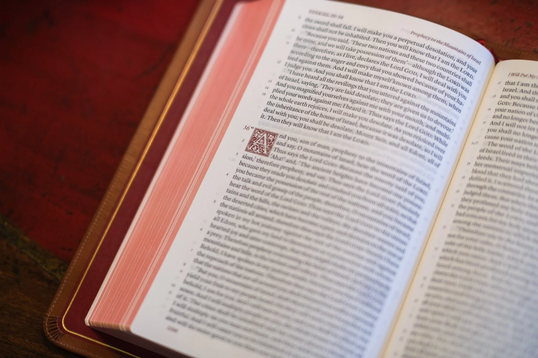
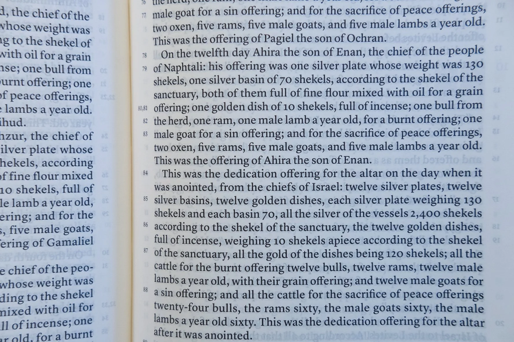
The Schuyler Treveris, typeset by 2K/Denmark, resurrects the NEB’s flawed system and irons out the kinks. Every verse is numbered, and each number is in the margin. Instead of alternating left to right as the pages turn, though, the Treveris always places the verse numbers on the lefthand margin. Open the Treveris and consider the page spread. On the left, the numbers are in the outer margin, but on the right they are on the inner margin. Let me be honest. When I first noticed this, it struck me as an oversight rather than an improvement, the sort of choice that makes sense for an infinite scroll but ignores the verso-recto realities of the printed page. Turns out I was wrong. It wasn’t an oversight on the part of Schuyler (I feel dumb even typing the words), but a deliberate choice grounded in the realities of reading.
Let me explain. The English language reads left to right, not right to left. Alternating numbers on the outer margin makes perfect sense … if you’re flipping through the book. But if you’re actually reading it, the experience is jarring. On a lefthand page, as I finished one line and my darts to the next, I pick up the verse number as I begin. But on a righthand page, I start the line in suspense and only find the verse number dangling like a German verb when I reach the end. By keeping the numbers always on the left, the reading experience becomes consistent. This may sound like a minor point. I suppose it is, in the overall scheme. But good design is often about minor points which make a perceptible difference.
Below: Pick up the verse number on the left, then scan the line until you hit a major punctuation point. Sometimes (as in verses 80 and 81 below) more than one verse is on the line, but typically there’s just one and it falls at a colon, semi-colon, or period.
Remember the two functions of verse numbers—navigation and orientation? It may seem that the way the NEB situates the numbers makes better sense for navigation, while the Treveris edges forward on orientation. Think about it: If you are flipping pages quickly in search of a particular passage, Bible drill style, you might prefer the NEB’s alternating numbers. That’s because you navigate quickly by keeping your eye on the header as the pages flash. If you’re racing forward toward a text ahead of you, you’ll be keen on the upper righthand header. If you’re backtracking to an earlier passage, keep your eye on the upper lefthand header. You’ll hit the right book, then the right chapter and verse range. Freeze right there. Now plunge down the outer margin until you hit the number you need. Bam—there it is. In the Treveris, you can’t do this. At least, not if the verse you need is on a righthand page. Instead, you’ll have to move from the upper right all the way over to the lefthand margin (in this case, the gutter) before heading down toward the sought-after number. If you’re doing timed exercises with the Treveris, this could cost you precious milliseconds.
Only, it doesn’t. Not if you actually try.
Because while it’s true that your eye has to jump from right to left when your eye lands on a righthand page, the fact is, your eye is accustomed to that. Remember, you read left to right. What’s actually unnatural is what you have to do with the NEB, which is to backtrack from the number in the outer margin, moving left until you reach the beginning of the verse. Essentially, by placing the numbers on the outer margin, the NEB flips the sequence more profoundly. On the left, you find verses by starting with the number and fast forwarding to the break. On the right, you have to reverse to the break. Which means that, in practice, the Treveris is better at both navigation and orientation. It really is the perfection of the technique.
6.
THE TREVERIS AESTHETIC
By now, you can see that I have meditated more than a human being should on the minutiae of verse numbering, and because you have stuck with me, so have you. If I have given the impression that the Treveris is a carbon copy of the New English Bible with a small tweak to the numbering system, that’s entirely wrong. There’s some shared technical DNA, but otherwise the two designs stand at opposite ends of the spectrum. The Treveris doesn’t aim for “clean and modern” like the NEB. In fact, the Treveris aesthetic leans ever so slightly in the direction of the Rheims New Testament. With its decorative drop caps, fancy fleurons, and two-color printing (red and black) it marries new to old to create a timeless artifact, a historically-flavored typeset that could only exist today.
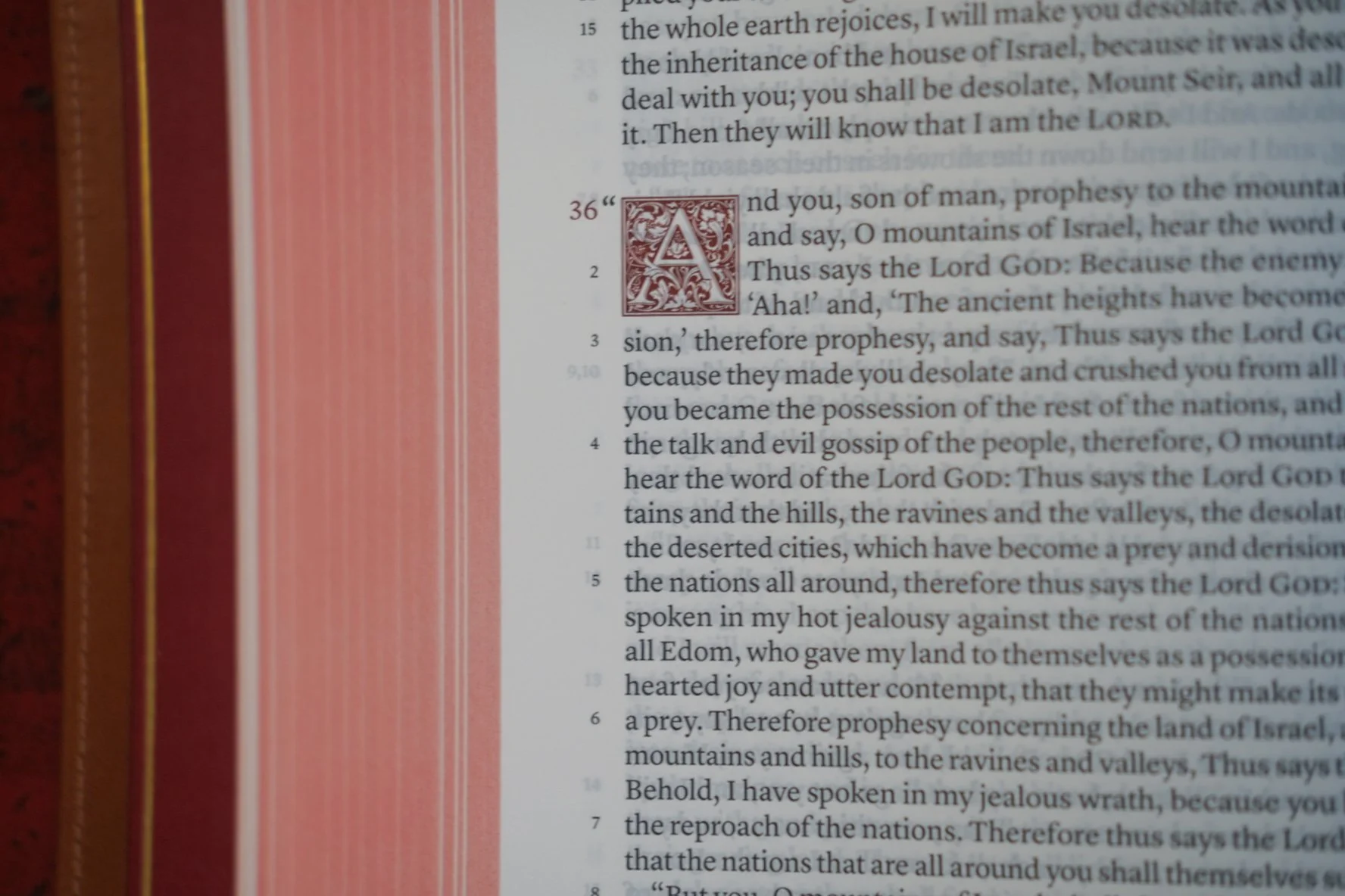
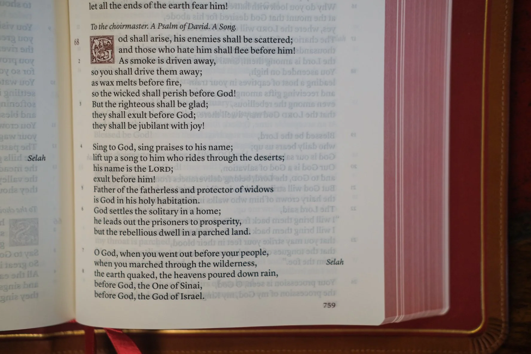
Poetry is the equalizer when you compare the Treveris to a verse-by-verse layout. No matter the method, verse numbers float discreetly in the margin.
Side by side, the Treveris is a big improvement on the NEB, not because of the tweaked numbering system, but because of its gracious proportions. Forget about the NEB, though. The Treveris outshines other Schuyler designs like the Quentel and Stridon (which we’ll discuss in a moment), and that’s really saying something. Both of those editions are impeccably wrought. I stand behind that verdict because I think what the Treveris sets out to do is harder. And the Treveris doesn’t just pull it off; it makes the whole thing look easy. The 10 pt. font size is tuned to the width of the column. The lines scan easily. As you would expect from the Schuyler team, the design is carefully weighed, executed with precision. The numbering system works all the better due to the fact that everything else on the page works so well. This is a beautiful design, and that makes it an ideal proof of concept.
While the Treveris isn’t a “pure” Reader’s Bible, when it comes to the hybrids, its method of marginal numbering makes it the apex predator. There’s enough room between the verse numbers and the text column that you can ignore the margin entirely for the fully immersive reading experience. Should you choose, though, you can take note of the numbers in passing as you read, ticking the box on orientation. And if the need to find a specific passage arises, you can do that, too. Locating chapter and verse is quick and easy. The Treveris eliminates distraction without sacrificing the utility of verse numbers. You can can use it to look things up, and to keep track of where you are. No other Reader’s Bible does what this one does, certainly not as well as it does. If you want the immersive experience without giving up the utility of verse numbers, there is no better option than the Schuyler Treveris.
7.
OBSESSIVE NUMBERING
It gets even better, though.
One of the reasons I’m so interested in the Treveris is that the problem it solves is one that I’ve wrestled with for quite some time. There is a conflict within me. On the one hand, I want the distraction-free reading experience of the most thoroughgoing Reader’s Bible. But on the other, I really like the perks that come with numbered verses. You’d pick up on the tension right away if you attended my church. In the liturgy, the sermon text is presented in paragraphed form, free of chapter and verse numbers. It reads like prose. When I preach that text, though, I refer to specific verse numbers. If I quote passages, I typically mention where they’re found—again, chapter and verse.
What can I say? I’m a man trying to have it both ways, trying to have my cake and eat it, too. A man looking for a hybrid.
But I am not a Bible designer. I only write about design. I do have a little bit of skill, though, and what I have has been applied over the years to the problem of verse indication. Chafing at the inescapable binary—either verse-by-verse or embedded in paragraphs—I’ve asked myself is whether there is another way to display the numbers. Before the Treveris, I knew about the NEB’s method and dismissed it as flawed. Was there another way?
I contemplated many options. The craziest by far was inspired by the Childcraft Encyclopedia I read as a kid. One of the volumes had acetate overlays depicting human anatomy. I’ll never forget this. Each transparent page showed a set of organs. Turning them peeled back the body, layer by layer—ribs, lung, heart. The concept was similar to the overhead projectors we used at school. What if you could print a Bible with these transparent pages, embedding the verse numbers, cross references, and notes on acetate you could peel back for pure reading? It would be the print equivalent of toggling off features in an app. In theory, it was beautiful. In practice it would be a nightmare. The book would be enormous with all the interleaved acetate, and you still wouldn’t get the uncluttered option I longed for by peeling back the page, because the text would need to be designed to leave room for the apparatus when in use. The poor printer tasked with executing my plan would have cursed the day I was born.
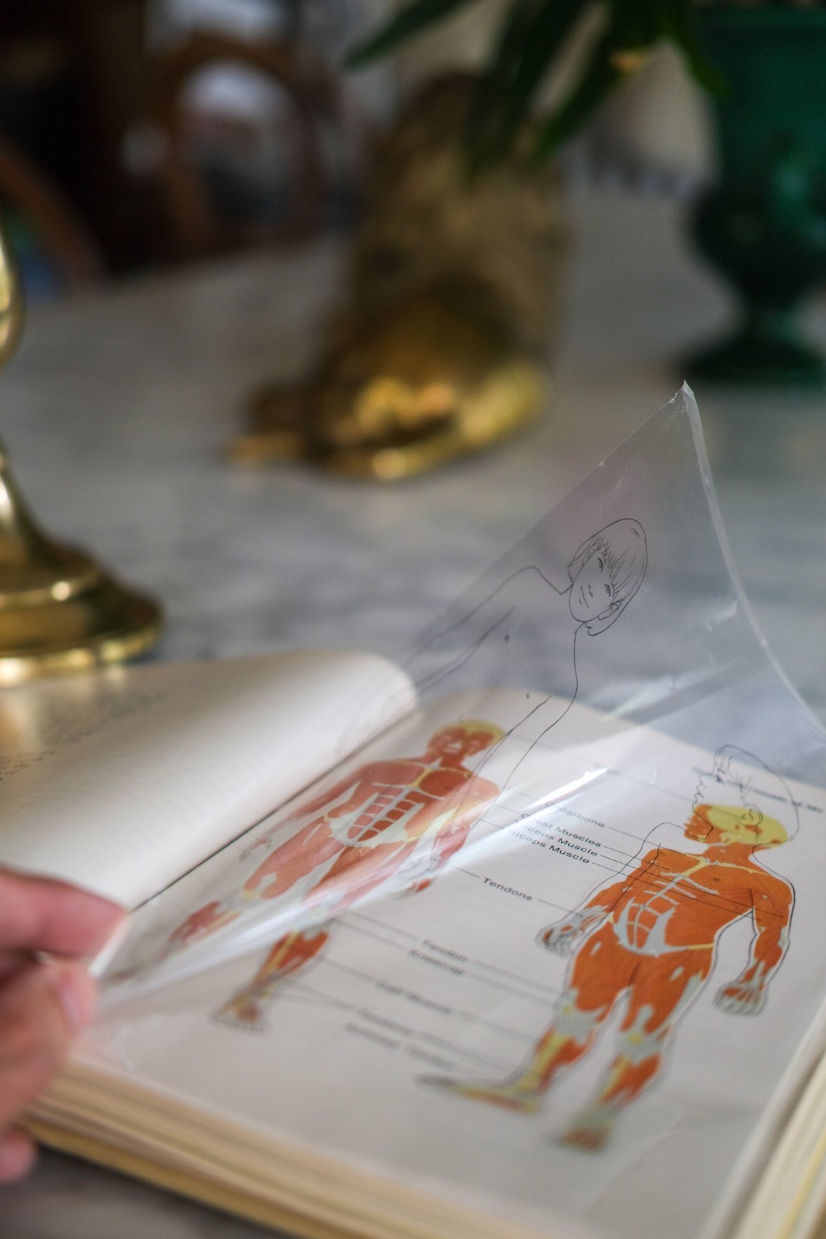
This isn’t the example I remember from childhood, but the concept is the same: the information printed on the acetate can be “toggled” off and on with the turn of the page.
Not that I ever seriously entertained this. The variation that struck me as more plausible channeled more childhood influences—namely, 3-D glasses and invisible ink. Print the apparatus using a special ultraviolet ink only visible through special glasses. The apparatus would be rendered invisible to the naked eye, but when you need to check a reference or find a precise passage, just slip on the x-ray glasses included with your purchase. Was this more realistic? Hardly.
If these seem like the ravings of a lunatic, it only goes to show that the problem is harder than it seems. The more time you spend thinking about it, the closer you edge into mad scientist territory. And the more you start thinking that embedding numbers in the paragraph is a good compromise, while nothing beats the efficiency of verse-by-verse. Then you do what I did. You make peace with the idea that there is a single axis with verse-by-verse on one end and no verses at all on the other. Pure reference versus pure reader, with nothing but compromise in between.
At first you’ll be tempted to put the Treveris somewhere in the middle. That’s what a hybrid is, right? Half this, half that. It will never be as good as verse-by-verse for navigation, and it will never be as good as no verses at all for deep reading. What I’m trying to tell you is that I’m not so sure anymore. That space between the numbers and the text might be enough that you can immerse yourself just as well as you could without any numbers at all. Even more surprising, it might just work the other way, too. The Treveris might be just as good at looking things up as verse-by-verse.
Or even better.
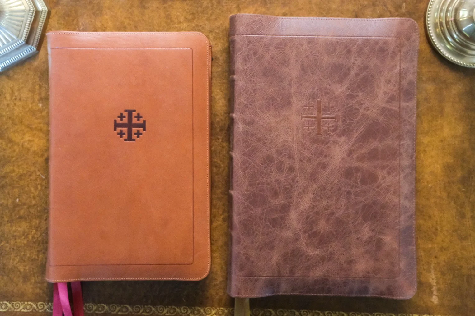
The Schuyler Treveris (left) compared to the Schuyler Stridon (right). Both are bound in calfskin, but the Treveris is stiffer with a natural finish, while the distressed hide wrapping the Stridon is extremely limp.
8.
ORIGIN STORY
This is heresy, I know. And I never would have fallen into error if it hadn’t been for the unique circumstances behind the piece of writing before you. It happened like this.
My bandwidth for writing about Bible design narrowed considerably about a decade ago when I began the process leading to my ordination. My bandwidth for thinking about Bible design didn’t go anywhere—but putting those thoughts on paper became increasingly difficult to justify. There were simply too many demands on my time. Add to this the fact that I had never set out to be a blogger or influencer. I’ve always thought of myself as simply a writer. The medium was just a matter of convenience. Like a book reviewer at a newspaper, I received copies of Bibles in the mail and used the pretext of reviewing them to share my conception of the world that produced them. In my ideal world, I could have been the Bible reviewer for the New York Times. But they never reached out, so I shared my writing online. The impact of that choice was beyond my greatest expectations. It took a lot of time, though.

Readers would sometimes joke about what their spouses would do to me: “Reading your blog has cost me so much money!” Well, I had a spouse, too, and if you think reading this stuff can cost you, imagine what writing it might do! Eventually I had to step back. By then, there were plenty of people who’d caught the bug. There was no danger of radio silence. This monologue had become a dialogue, and it wasn’t going anywhere.
I had a lot still to say, though, and one day I found myself on a call with Sky Cline, founder of Schuyler. We go way back. The day I first thumbed through the mockup of the Cambridge Clarion, Sky was there. We have been in touch ever since. On this particular call, he was saying how much he missed my writing, and I was explaining that I missed it, too, but what could I do?
“What if I commissioned you to write something?” he asked.
“Like … a sponsored post?”
“Anything you want. Any Schuyler Bible you’re interested in. What would it take to make that happen?”
Here’s the thing. This played directly into a daydream I’ve entertained for ages, the idea that writing about Bible design could be, you know, a … job. And there was another thing: I actually did have something I wanted to write about, the Schuyler Treveris, which had come out after my writing schedule collapsed, which meant I’d never had a chance to put my thoughts into words. (Perhaps that explains the length of this piece.)
Sky agreed to the idea, and before we got off the phone I added one wrinkle. In addition to the Treveris, I wanted to do a sidebar on another Schuyler, the Stridon. Something for the sake of comparison, because the Stridon is essentially the anti-Treveris. It’s a modern take on the classic verse-by-verse format, kryptonite for those of us who hold to the Reader’s Bible ideal. Over the years, I had never made a secret for my antipathy toward verse-by-verse layout, particularly when its mated with a single column text. The two choices are contraindicated. Single column takes the inherent design problems with verse-by-verse layout and multiplies them by ten. But Sky was cool with me taking my shot. Say what you want, just say something. That’s not a direct quote, but I think I’ve interpreted the tone pretty well.

The Stridon’s verse-by-verse layout is anathema to me—but this is a great execution of the concept, and as a physical object it’s quite impressive.
If you don’t know, the Stridon is a hefty tome. Its monumental scale reflects an ideal use case scenario: opened flat at the pulpit before a preacher accustomed to line-by-line exposition. The Stridon’s traditional verse-by-verse division of the text is what that expositor is looking for. Despite the popularly of paragraphed editions, there have always been those who carry a torch for the old approach. They aren’t just change-resistant Luddites, either. Their argument is quite practical. In a verse-by-verse layout, they say, it’s much easier to find a specific text. Every verse begins on a new line, announced by its verse number at the left-hand margin. Find the right page using the header, then let your eye race down the left margin until you get to the right number. It’s the ground we’ve covered already. Verse-by-verse is the gold standard. Not only is it practical for readers, it’s a life-saver for pulpiteers looking to save precious seconds as they turn from passage to passage. They’re also much less likely to loose their place in the text, something preachers have complained about since the advent of paragraphed Bibles.
In my day I have scoffed at such people, just as I’ve dismissed the complaints of those who think 6 pt. type is too small to read. Time has a way of mellowing old revolutionaries. I’ve grown sympathetic to these concerns.
Not that it takes much sympathy to appreciate the Stridon. It’s not your great grandfather’s idea of verse-by-verse. This is the classic idea executed with all the poise Schuyler brings to each project. The Stridon cannot escape the difficulties inherent to the format, but it can certainly put them in perspective. Let’s talk about those issues first, though, to get them out of the way. When the Scriptures were broken up into verses, the breaks sometimes fell awkwardly. If you place each verse on a line of its own, some will be short and others long—and a few will be so long that they overflow the length of the line. These line breaks are not intentional (i.e., they are not deliberately chosen, or consist from one edition to another). They just happen where they happen. Sometimes it makes no difference. Sometimes the result forces a typographical fault, or worse, implies an emphasis in the reader’s mind that the translators never intended. When publishers put out a volume of poetry, they take care that the lines only break where the author intends. In a verse-by-verse setting, it’s the format that makes these decisions, not the author, the translator, or even the designer.
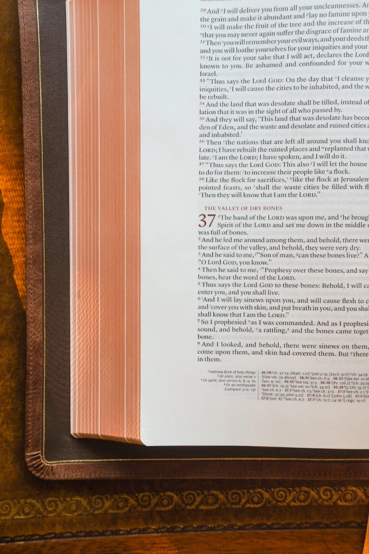
Above: Notice the short one- and two-word lines above? “Israel,” “be rebuilt,” “and inhabited,” and “bone.” These forced breaks are inevitable with verse-by-verse layout, and single column settings exacerbate this.
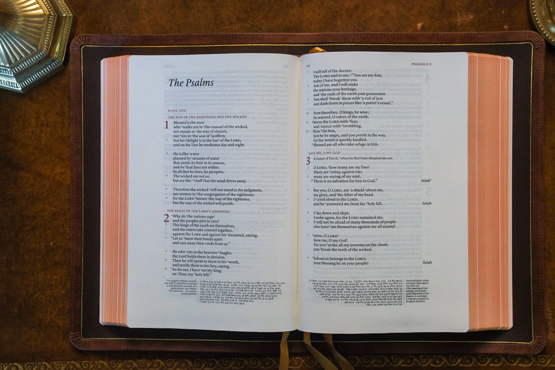
As noted earlier, poetry looks similar regardless of layout. Verse-by-verse and paragraphed, whether numbers are in the margin or within the text—they all look good in the poetic sections.
In a double column setting, this can create odd moments. You’ll find a verse that breaks after the penultimate word, dropping the last word to the next line where it sits all alone. In prose we sometimes pull these tricks to catch the reader’s eye. We want you to
Pay
Close
Attention.
But when it happens by accident, your brain doesn’t always know the difference. You pause over that lonely word in a way you wouldn’t otherwise. No big deal for the most part. Occasionally, though, it matters.
In a single column setting, the problem is exacerbated because the line length increases. This smooths out shorter verses. Longer ones, however, run the risk of overflowing even a wider line. Those isolated final words stand out in a double column setting. In a single column, they jump up and down. The page gets choppy, sometimes looking like an advancing column of soldiers who’ve taken too much flanking fire.
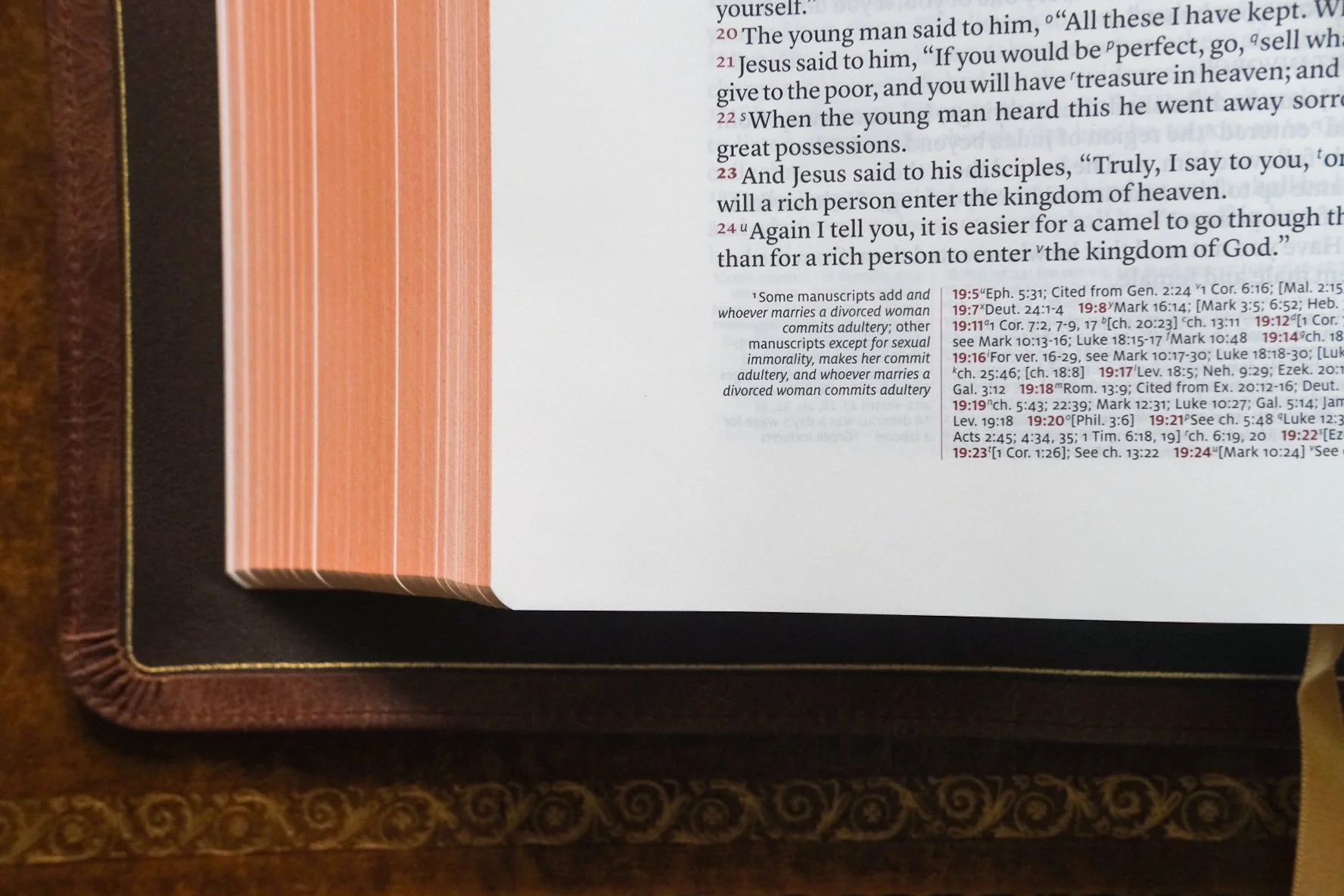
See the way the Stridon handles textual notes and cross references? I’m fascinated by these uneven columns because, from page to page, they must expand and contract, yet they always maintain their elegance.
The Stridon shows some of these effects, but it compensates in other areas. The verse numbers, for example, are tucked into text somewhat. Instead of setting the column flush with the numbers out to the side, if a verse is long enough to drop to the next line, it starts below the number. This means the verse numbers don’t stand out like the icons in bulleted text. Instead, the words wrap around, so to speak, set apart by more subtly by their red ink. The exception, of course, comes with poetry, which is true in pretty much every modern setting. Whether you go verse-by-verse or paragraphed, in poetry you’ll find verse numbers discreetly to the left as they are in the Treveris (which is why, if you compare them side-by-side in the Psalms, the contrast is less pronounced).
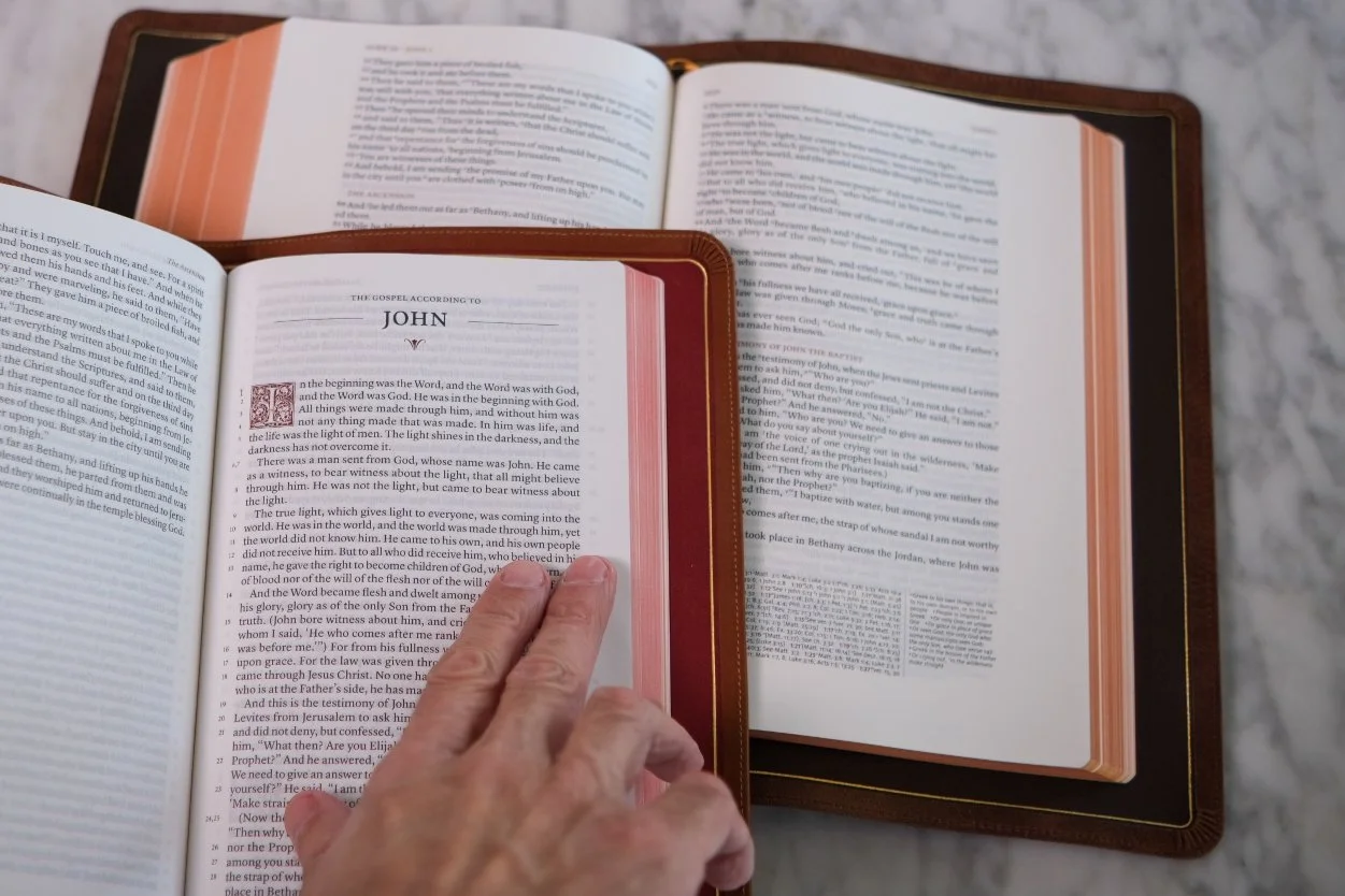
Consider the contrast between the two layouts. While the Treveris presents an even block of text, the Stridon’s constant line breaks create a lot more empty space.
Another thing I find stunning in the Stridon is the way it handles cross references and textual notes. You’ll find them at the foot of the page set in asymmetrical columns. Because the volume of references and notes varies so much from page to page, this form must expand and contract accordingly. Doing this is challenging enough, but doing it gracefully is another matter. Somehow the Stridon always looks put together, not a hair out of place. I can’t remember the last time I flipped through a Bible simply to admire the handling of the references. If you care about such things, the view is breathtaking.
Again, Schuyler cares about the details, so none of this should be surprising.
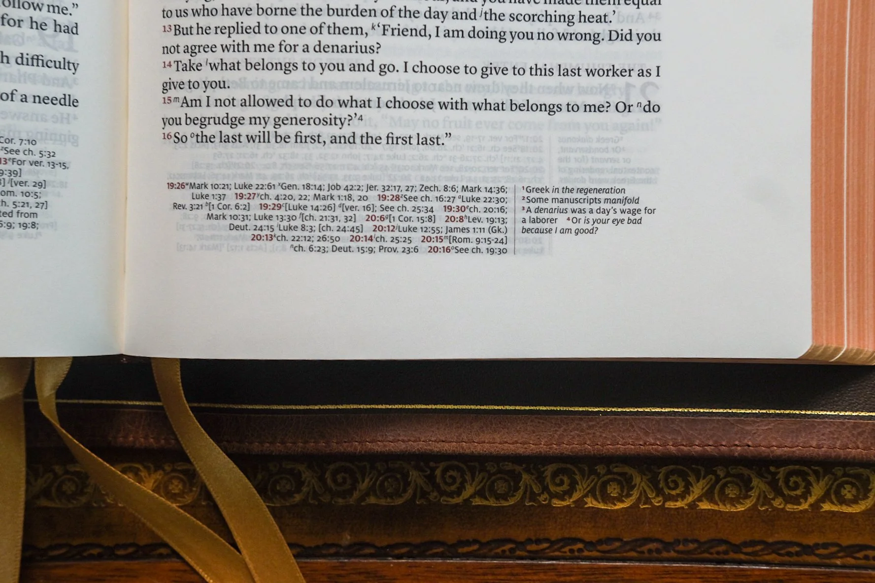
Again, let’s admire this footer. I can’t get enough of it.
Even the bulk of the Stridon lends it dignity. A large text block like this with a limp binding always has a luxuriant quality to it. Some books lay flat, while others repose. The Stridon falls into the latter category. While the smaller proportions of the Treveris make for a handier volume, I like the Stridon’s liquidity and weight.
Also, before getting into the heart of the comparison, it’s worth mentioning that neither of my copies is bound in the glossy goatskin that has become the standard for high end editions. Instead, I have them in calfskin. The Treveris is bound in what Schuyler refers to as Saddle Brown Calfskin, a smooth, finely grained aniline leather with a bit of heft to it. This family of leathers is one of the most interesting Schuyler is using today, because its a natural, uncoated skin that will show patina over time. If I had any gripe with goatskin, it would be how good the stuff looks even under assault. I like to see the wear and tear, so the Saddle Brown speaks to me. (I just wish I could bring myself to test how much it changes with abuse. I don’t have the nerve to speed the process along.) The embossing on the cover is blind stamped without foil, dark letters contrasting against the lighter hide. I prefer classic gilding, but this is a deliberate look common to some Schuyler editions. Inside, the lining is a well-chosen deep red. This combination of tan exterior and red lining recalls the classic bridle leather briefcases of London outfitters like Swaine Adeney Brigg. When you open the Treveris, that red lining harmonizes with both the red-under-gold page edges and the red ink on the page. Pure class.
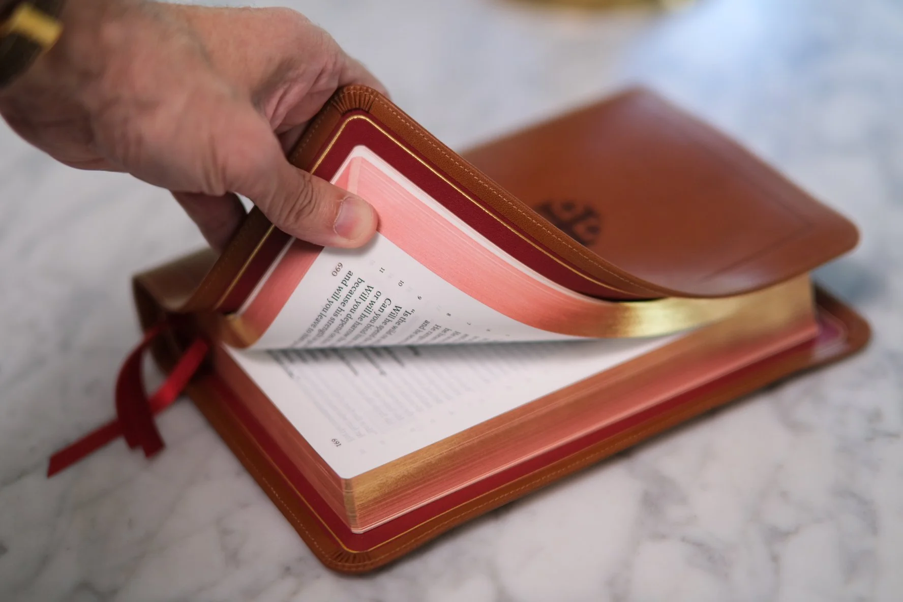
The Stridon’s tan cover and dark red interior make for a tasteful combination, reminding me of the vibrant skiver linings inside classic bridle leather briefcases.
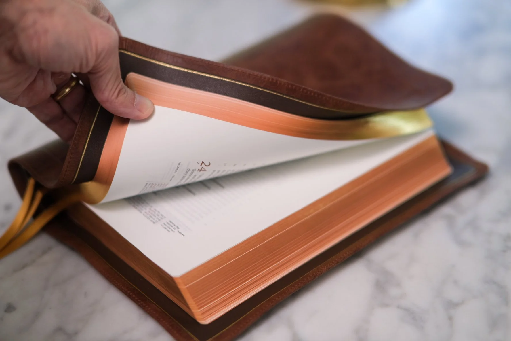
The Stridon’s distressed brown cover with dark brown liner are nice, too, though the cover reminds me less of British leather goods than an overstuffed lounge chair at a Colorado ski lodge.
By contrast, the Stridon features a mottled shade they call Chestnut Calfskin. This is an Italian online leather used in the furniture industry with a thinner, more pliable hand and a deep, wrinkled grain. Pinch and twist with your hand, and you’ll remember that leather is skin. I have mixed feelings about this binding. On the one hand, my taste in leather goods trends toward polish more than pre-distressed. On the other, choosing a material that combines the high durability necessary for the use and abuse furniture receives and the low resistance floppiness of the limpest of leathers contributes to the Stridon’s extraordinary feel in the hand. Aesthetically, I prefer the look of the Treveris. Blindfold me, though, and it’s the Stridon that captures my attention.
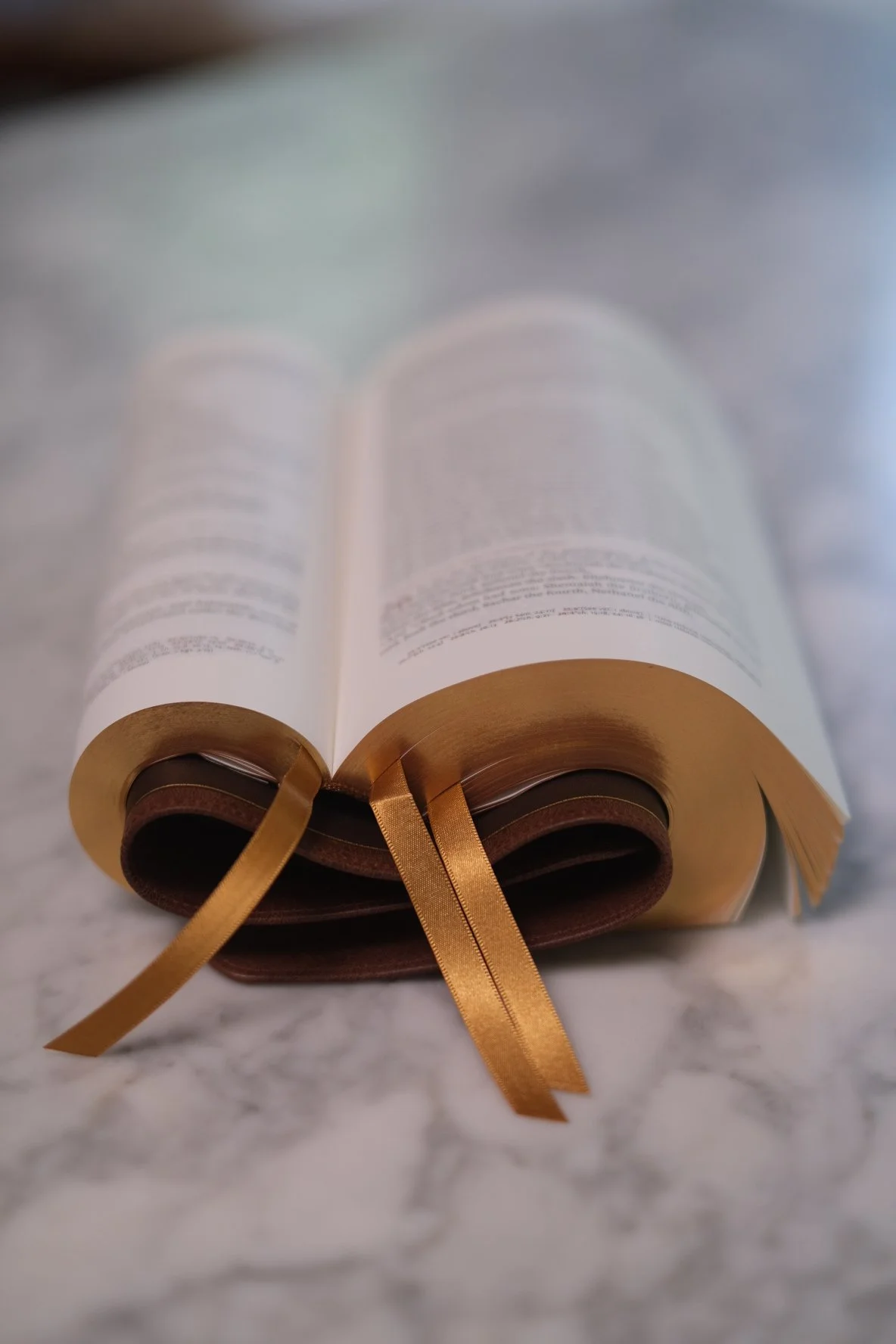
The Stridon’s cover was made for “Bible yoga,” which demonstrates the limp pliability of a leather cover (while putting no stress on the binding).

Not as limp as the Stridon, though likely to soften with use, the Treveris cover can flex when it needs to, but is rigid enough to stay straight when held open in the hand.

Georgie doesn’t mind sharing his club chair with the Stridon (above) and the Treveris (below). Note how the Stridon wraps around the arm of the chair while the Treveris cantilevers outward like outstretched arms.

Both of these Bibles feature a “full yapp” cover, which refers to the way the leather is cut taller and wider than the book block then curved like a clamshell around the pages. The effect resembles one of those zipper lined Bibles, only with the zipper pulled off. Full and semi-yapp covers are a hallmark of classic Bible publishing that have enjoyed a comeback in recent years, at least at the top end of the market. While there is a certain degree of utility—that overlapping edge affords protection to the pages—it is mainly an aesthetic move. The only trade off is that the extra material can make a full-yapp Bible slightly unwieldy in the hand. The more flexible the cover, though, the less you’ll notice this.
The full specs on the Stridon, available at EvangelicalBible.com, are as follows:
ESV Text Edition: 2025
Full Yapp Chestnut Calfskin Cover, Brown Calfskin Lining
Page size: approximately 6.3″ x 9.3″ x 1.6″ (159 mm x 235 mm x 40 mm)
~1.2 inch outer margins
Font: 9.5 pt
Words of Christ in black
Line Matching
36 GSM Primabible Paper
3 x 1 cm burgundy ribbons
Art-Gilt edging (red under gold)
Bold verse numbers to indicate new paragraphs
More than 80,000 entry cross references
Concordance
Presentation and Family Records Pages
Exclusive Schuyler Bible Maps
For the Treveris, the official rundown from EvangelicalBible.com is similar:
ESV Text Edition: 2016
Siena Italian Saddle Brown Full Yapp Cover, Dark Red Leather Liner, 3 Red Ribbons
Trim Size: 5.5″ x 8.5″ x ~1.1″ (140mm x 215mm x ~28mm)
28 GSM Paper
Font: 10 pt.
Single Column Paragraph format
Single Column, Verse-by-Verse format for Psalms, Proverbs, Song of Solomon, and other Poetry
Ornamental Drop Caps
Concordance
Line Matching to avoid “see through”
Blind embossing on spine (any personalized imprinting will also be blind to match the spine)
Art Gilt Edging (brown under gold)
Exclusive Schuyler Bible Maps
The big differences to note are the type size and paper spec. The 10 pt. type of the Treveris is slightly larger than the Stridon’s 9.5 pt., while the paper the Treveris is printed on comes out thinner at 28 GSM than the Stridon’s 36 GSM sheet. The Stridon is thicker as a result. Given the larger trim size, the Stridon would pair nicely with a 6”x9” notebook, or the larger B5. My Sterling Ink Common Planner, for example, is the B5 model, and while the footprint is a bit taller and wider than the Stridon, they’re a great match not only in size but in flexibility. The Treveris plays nicely with standard A5 notebooks. I’ve been using a Kokuyo Century Edition notebook recently, tucked into the Gfeller Leather cover from Nanami Paper, and the match is nearly perfect. The Century Edition’s 52 GSM paper is thin by notebook standards, if not Bible specs, so the two make for a harmonious team. Of course, if you opt for one of Schuyler’s in-house journals, you can match the leather cover to your Bible.
Speaking of covers, another thing I appreciate about both of my review copies is that they don’t play it safe. Okay, that’s not entirely true. There is a big market for each, so Schuyler isn’t exactly rolling the dice. But there was a time when Bibles, like Model Ts, were available in every color so long as it was black. Once we had choices—black, brown, tan, red, and even green—it felt like New Jerusalem was breaking through the clouds. Eventually, though, you realized that Bibles came in every kind of leather so long as it was goatskin. In the crazy Golden Age of Cambridge publishing back in the sixties and seventies, it wasn’t just the fact that “ultramarine” was considered a reasonable option, but that it might be azure water buffalo, or bright blue sealskin, or maybe some grainy calf the color of Mediterranean waves. The variety of material was every bit as fascinating as the indulgent use of color. Seeing Schuyler use leathers like these makes me think we’re heading in a good direction. Let’s encourage that kind of exploration.
9.
BRASS TACKS
Let’s circle back around, though, because despite my praise for the Stridon, I didn’t stick in the lineup to garner accolades. It’s here to take a whipping. I chose it to set the Treveris in stark contrast, to make the approach I admire glow all the brighter in comparison to the one I want to leave behind. The Stridon doesn’t make that easy. But as I studied the problem, something surprising took place. The one area where I could make no case for the superiority of the Treveris was always going to be the function I’ve been calling navigation, that ability to zero in on one line buried in the ocean of Scripture by way of chapter and verse. The Treveris might be more readable, but it could never beat the Stridon in a sword drill.
No hybrid could, right? The ESV Reader’s Bible certainly couldn’t. When someone calls out a verse, if you’re holding one of those, then no matter how slow I am, I’ll find the reference in the Stridon before you’re even in the ballpark. And I’m not particularly fast, and my fingers have a hard time with sheets of thin Bible paper. The difference in the apparatus is so pronounced that I’ll bet on myself regardless, so long as I have that verse-by-verse layout. The story changes somewhat if you trade that Reader’s Bible for something like Crossway’s Heritage Edition (pictured below, right), a graceful design that retains chapter breaks with descriptions, and begins each of its paragraphed verses with its respective number in bold superscript. You might be able to pick out the verse numbers in those paragraphs almost as quickly as you could in verse-by-verse. Still, my money would be on the Stridon. The competition might be closer, particularly in those poetic sections where all numbers align left for us all. But picking out number buried in a paragraph is always going to be slower than verse-by-verse.
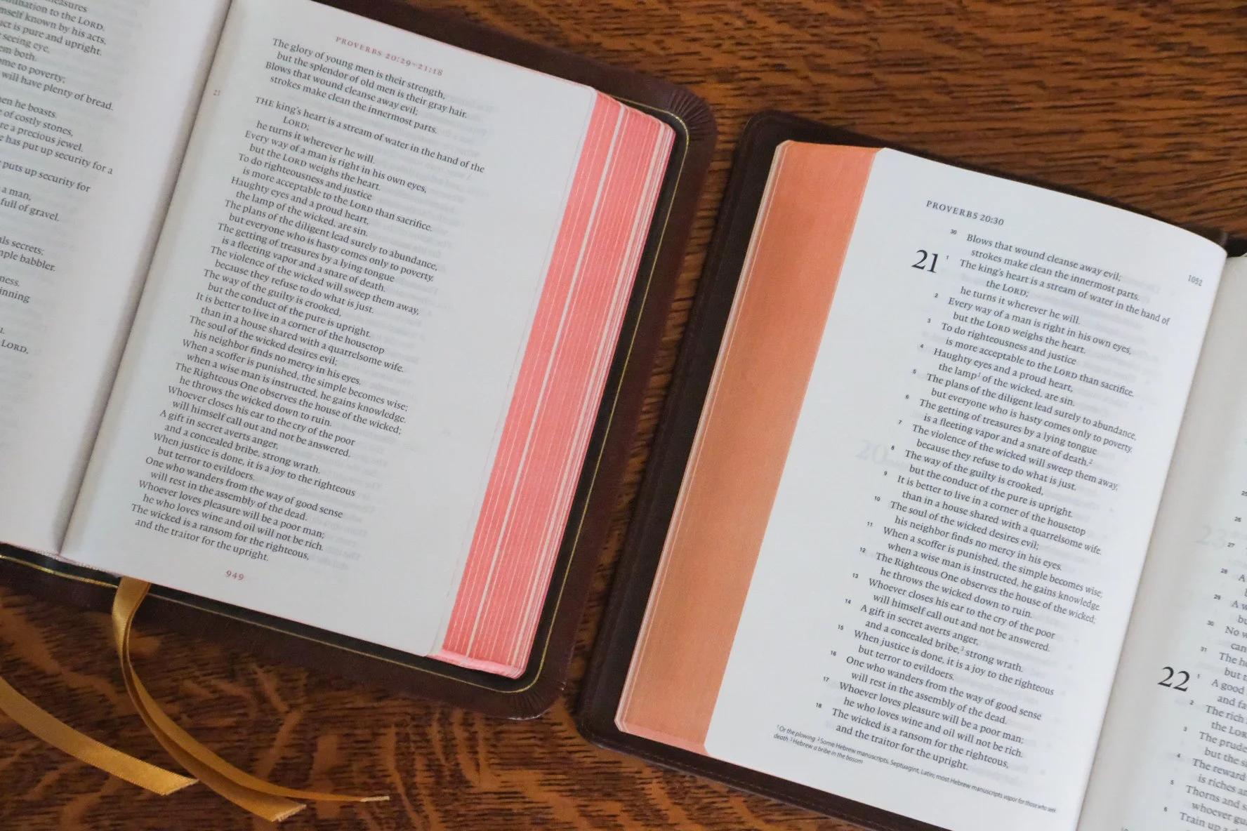
This is all common sense. Reader’s Bibles, by definition, can’t go toe-to-toe against verse-by-verse. That’s the choice they made. Say what you want about hybrids, but they’re the equivalent of the screwdriver on your Swiss Army Knife. Good in a pinch, but brother, you don’t take it to the job site. You’ll never beat me if I’m using the full-size tool. We both know that.
Only, here’s the thing. The more I use the Treveris, the more I come to believe that in the side-by-side comparison, verse-by-verse has little to no advantage.
Judgments of this sort can only ever be subjective. The efficiency of a tool may not be the deciding factor. An experienced workman using an inefficient tool can do things a lesser craftsman can’t achieve regardless of the gear. I concede this. All things being equal, though, the Treveris system as a tool seems every bit as efficient to me as verse-by-verse. It works differently, but just as well. That’s my take, at least, and if I’m right, then this is surprising. Could it really be the case that, in the quest for a hybrid Reader’s Bible, the Treveris can beat the old verse-by-verse at its own game?
Call me crazy, but I think the answer is yes.

10.
ONE LAST THOUGHT
To make a long story short, the reason the Treveris impresses me so much—and gets top marks over the other fine offerings from Schuyler—is twofold. First, it’s a Reader’s Bible, and that’s a format I love. Second, the way it handles verse numbers uses smart design to solve a real problem. Whether you agree with me or not that this method, once you get used to it, is every bit as effective as traditional verse-by-verse, I hope you can appreciate my enthusiasm.
While Schuyler’s Quentel and Stridon are both remarkable in their own right, they take a familiar idea and execute it with creative precision. That’s wonderful. The Treveris, however, is not quite like anything else on the market right now. The historical pedigree is undeniable, and yet there is something new in how the details come together. For my money, that makes the Treveris the most unique contribution Schuyler has made to our Golden Age of Bible publishing.
Or should I say, the most unique … so far?