Reuniting With Cambridge’s Pitt Minion
This summer I decided to take the Cambridge Pitt Minion on the road. Does it still have the old magic, or has the new generation of reader-friendly editions turned this little Bible into a relic of the past?
Blame the Schuyler Personal Size Quentel. The compact size of that edition got me thinking about how nice it would be, come summer, to travel with a smaller, slimmer Bible. I teach from the ESV, though, and the Personal Size Quentel ESV has not yet been scheduled for release. There was another problem, too: I was not sure whether I could stand returning to a double-column text setting. Sure, I still use them, but going back and forth is not the same as having no other option for two whole months.
In the end, I decided to give this experiment a try. I would leave for eight weeks on the road with Worldview Academy with a double-column compact, and since the PSQ was not an option, I descended into the book cellar and returned with my old friend, the Pitt Minion.
This is the story of the reunion.

HOW IT ALL BEGAN
When the Pitt Minion ESV first arrived from Cambridge back in 2008, I noted a couple of miscues, one practical and the other aesthetic. Practically, the brown goatskin cover, beautiful as it was, felt too stiff thanks to the book boards used under the leather. Flipping pages became a chore, because the cover was always fighting you. Aesthetically, the black lining made little sense. It did not match the Pitt Minion’s exterior, but it did not complement it, either. Colorful leather goods with factory-standard black linings always suggest that, however much thought went into the design, it was only skin deep.
These disappointments almost led me to write the Pitt Minion off, which turned out to be a good thing. I did not baby it. In fact, I pretty much abused it, with the result that in no time at all, the stiff cover was broken in, the book opened flat, and all my functional concerns disappeared. (I wrote about the breaking-in process here. And here.) The lining did not change colors, but I paid less attention to that. Creased and aged, its cover gently battered, the gilding flecked, my Pitt Minion gained a comfortably lived-in quality. You can tell that I don’t worry about damaging the Pitt Minion when you scroll to the bottom of this post and check out the photo of the cover speckled with water. I placed it too close to a fountain, saw the problem, and snapped the picture instead of snatching the Pitt out of harm’s way.
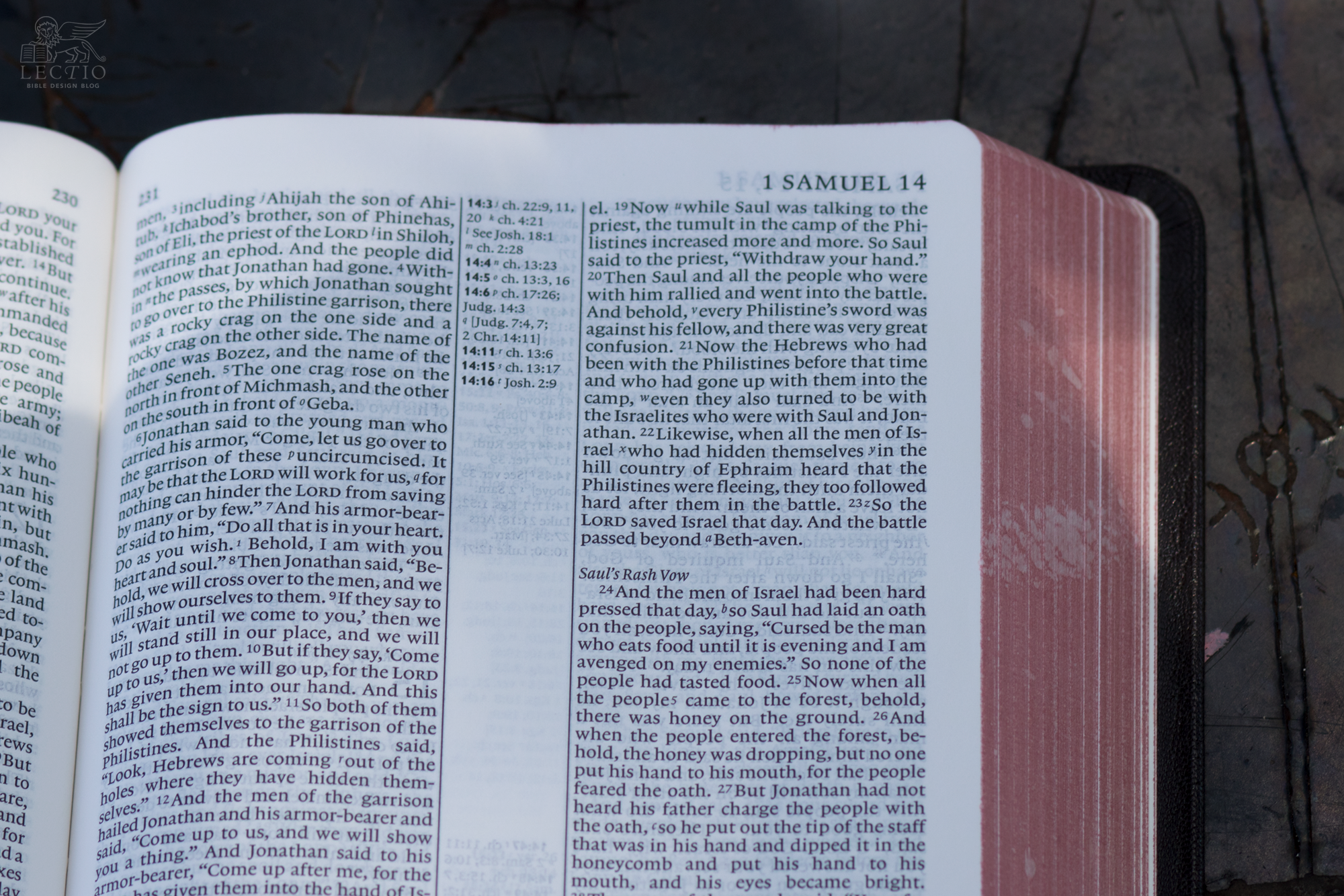
The Pitt Minion was thin enough to slip into the notebook pocket in my briefcase, yet sufficiently full-featured that I never felt the lack of a larger Bible. I used mine constantly, recommending it warmly to anyone who would listen. Because the Pitt Minion came in a variety of bindings and translations, it worked for a wide variety of people. The only limit proved to be the small type, which did no favors for older eyes.
Since I could cope with the fine print, the Pitt Minion became my everyday edition, the one I read and taught from, until it was finally replaced after the introduction of Cambridge’s single-column Clarion. Since then, it has been boxed up on the shelf in the Bible Design Blog archive, seemingly forgotten, waiting for the day it might once again see use.
STILL GOT THAT MAGIC
Here’s what surprised me: picking up the Pitt Minion again, not a beat was skipped. This slender Bible springs open flat and stays that way. The cover, now supple from handling, bends to my will, so that I can hold the Pitt Minion folded in one hand. When not in use, it tucks away anywhere that a notebook will fit. In fact, the Pitt Minion is only a little bit wider than the Nanami Paper Cafe Note journal I have been using this summer, so I carry them rubber-banded together along with an Ateleia brass pen and the case for my eyeglasses (more about them in a minute).


The Pitt Minion occupies a sweet spot between pocket- and regular-sized editions. At 7.5” x 5”, this isn’t a subcompact you can slip into the back pocket of your jeans, but because it’s only a shade thicker than three quarters of an inch, you never get the impression of bulk. Yet all the features of a larger reference edition are present, albeit at reduced scale. Opacity and page thickness are comparable to that of the Cambridge Clarion, which means there is more ghosting than you would see with the Schuyler Personal Size Quentel. Then again, the better-appointed PSQ is not quite so svelte.
I have enjoyed spending time with this old friend. It really is a wonderful all-around companion, ideal when you need to pack light without sacrificing features.
Ideal companions: The Pitt Minion has paired nicely with this Cafe Note journal from Nanami Paper and the Ateleia brass pen in its leather sleeve. I’ve had to tote my eyeglass case, too, since my prescription sunglasses have the new specs, while my everyday glasses do not.
TIME TAKES ITS TOLL
As you can see in the photos, the art-gilt page edges have suffered a bit over time. That doesn’t bother me. I appreciate the way a well-made book ages with use. Still, time has taken its toll, not so much on the Pitt Minion as on yours truly. As I mentioned in an earlier piece, my optometrist recently sentenced me to the third circle of … wait, no, it’s not that bad. Progressive lenses, that’s all, the invisible equivalent of bi-focals. Problem is, due to some bad timing and my travel schedule, my new prescription has not caught up with me on the road.
The Pitt Minion’s text is set in 6.75 point Lexicon No. 1, with 7 point leading (i.e., line-spacing). That never gave me too much of a headache in the pre-Clarion era. Now I find myself holding the page a bit too close to my face, peering over the top of my glasses like a censorious schoolmaster. Anyone watching me read might conclude from my expression that I am far more skeptical of the content than I am. I’m only skeptical of my attempts to parse the lines. On the plus side, I never find myself wishing the Pitt Minion came without in-text verse numbers and cross-references to distract the eye. My eye barely registers them.
Readability, of course, is not solely (or even primarily) a question of type size. A good single column edition without the distractions of a reference Bible lends itself better to immersive reading than a double column reference, even when the type size is smaller. The Pitt Minion sports a reference layout and tiny type, which means it is best suited to short sessions. That’s why, in addition to the Pitt Minion, I brought along a volume of Bibliotheca. I use the Pitt for general purposes, and the Bibliotheca volume for extended personal reading.
For all this, I have been using the Pitt Minion for a month now without any ill effects, and while I do miss the readability of my Clarion, the slim profile has more than made up for the negatives. When Cambridge brought back the Pitt Minion, they revived a classic. And like most classics, it had endured for a reason. As much as I love the recent proliferation of single column text settings — I wouldn’t dream of trading in my Clarion for the Pitt on a permanent basis — the fact is, this little Bible still has what it takes. You could do a lot worse choosing a one-and-only edition. And as a back-up when you have to go lean, the Pitt Minion still rules.


