Personal Size Reference Edition (ESV)
 My reviews don’t often come with a preface, but in this case I think it’s necessary. The Personal Reference ESV needs to be judged in a particular context. There are only a handful of single-column text settings on the market, and I’m at a loss to think of any other single-column reference versions. I suspect that, in spite of the success of The Message, publishers still view the format as risky. They might sympathize with the rationale behind giving the Bible an updated, more readable format, but that doesn’t allay fears that the market isn’t ready for it.
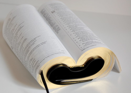
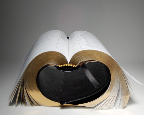
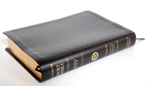 Above: The Personal Reference ESV with black TruTone cover.
In our little slice of the market, though, the change is long overdue. I doubt any of us think that a single-column, paragraphed setting is a panacea, or that the traditional double-column settings should disappear, but there seems to be a consensus that if the Bible is meant to be read, it should be formatted for reading rather than reference. It should look more like a novel, in other words, something meant to be read cover-to-cover and less like a dictionary, where you just look things up.
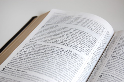
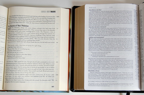
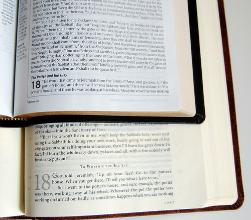
Above: A typical page spread.
The problem is, when you do something new, it’s difficult to get all the details right. The Personal Reference ESV does many things well, but it also suffers from several drawbacks, some negligible and others more serious. To me, the campaign for good single-column, paragraphed text settings is just as important as the need for quality bindings. As a result, I’ve given the subject a lot of thought, and I have some fairly particular ideas about what makes single-column settings work. I’m going to share some of them during the course of the review, in the hope that they’ll benefit future editions of the Personal Reference ESV as well as helping the designers of future single-column settings.
But the last thing I want to do is smother this new edition in criticism. Yes, there are things I would have changed, given the choice. On the whole, though, I’m extraordinarily pleased with the Personal Reference ESV and would like nothing more than to see it available in a quality binding. This is a milestone, and I don’t want its significance to be obscured by the edition’s admitted imperfections.
Above: Book openings feature short introductions with grayscale backgrounds, and the text on each page is bracketed on three sides by a thin line. I call this superfluous design "studybiblitis" for obvious reasons, but it doesn't distract as much as I thought it would.
A COUPLE OF FIRSTS
I’m going to go out on a limb and declare that the Personal Reference ESV is now the best edition of that translation published by Crossway. Some will object, so let me briefly state my case. This edition represents two important firsts:
1. This is the first single-column, paragraphed setting of the ESV text. Sure, there’s the Single Column Reference, but that setting devolved to the archaic verse-per-line format that visually emphasizes isolated phrases above complete sentences and paragraphs. In a single column setting, it also results in awkward breaks and plenty of unintentional white space. The Personal Reference ESV is a different animal entirely.
2. This is the first truly “hand-sized” edition of the ESV. At 5.5” x 7.5” x 1”, the proportions approximate those of a trade paperback book. The Personal Reference ESV is small enough to carry around but still sufficiently large to use comfortably. It’s a bit bigger than the Cambridge Pitt Minion, but in the same territory. It feels more natural in the hand than either the Classic Reference or the Classic Thinline. In terms of size, it is very close to the R. L. Allan’s Oxford Blackface Brevier (seeing them side-by-side conjures all sorts of fantasies about an Allan’s Personal Reference ESV).
Obviously, the Personal Reference isn’t the best ESV in terms of quality. The best edition Crossway publishes, in terms of materials and aesthetics, is the Classic Reference in cordovan calfskin. The best edition available is the R. L. Allan’s version in highland goatskin. But in terms of size and layout, the Personal Reference -- while not perfect -- strikes me as the current leader.
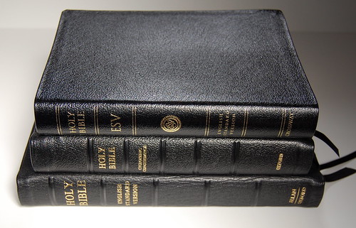
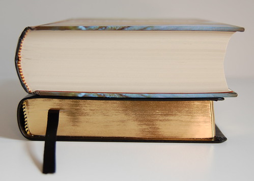
Above: Size comparisons. The Personal Reference in genuine leather (on top) is close in size to the R. L. Allan's Brevier Blackface KJV (middle), and a good bit smaller than the Allan's Classic Reference (bottom, shown here in its first edition). Imagine a Personal Reference kitted out in highland goatskin!
WHAT THE PERSONAL REFERENCE GETS RIGHT
That shouldn’t come as a surprise to anyone who reads this blog. I’m a champion of single-column, paragraphed settings, so I’m naturally going to prefer them to anything else. But if the initial reaction is anything to judge by, not everyone who likes single-column settings is happy with the Personal Reference ESV, so let me take a moment and explain why I am.
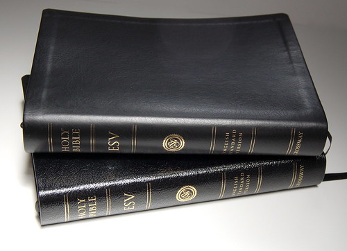
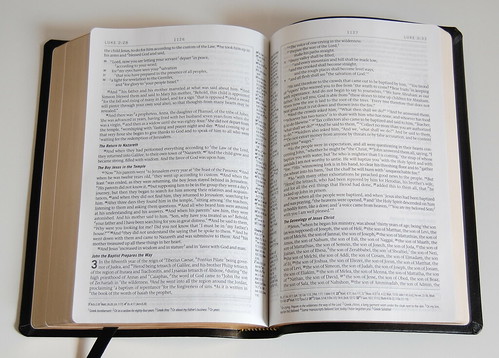
Above: Another comparison. The TruTone cover (top) versus the genuine leather (bottom). The TruTone is much nicer -- if only it had a sewn binding like the genuine leather edition!
I admit up front that the execution of the single column layout isn’t quite right here. You can see that as soon as you open up the book. (In a moment, I’ll explain just what’s wrong and how it could be fixed.) But there’s a difference between “not quite right” and utterly wrong. The Personal Reference is close to what it ought to be. The Single Column Reference wasn’t, and I made no bones about pointing it out. In this case, though, I’m not going to let the failure to achieve the ideal stand in the way of appreciating the Personal Reference’s significant gains.
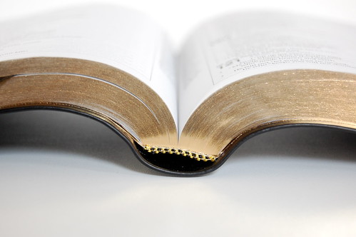
The first thing I did when I received mine was pull the pages apart. The spray-on gilt sticks them together, which prevents the text block from flowing naturally. If you want to experience this edition at its best, you have to separate the pages first. Once I was done, I curled up in my favorite chair and started reading. I flipped through familiar passages, then settled in and started to read Ephesians aloud.
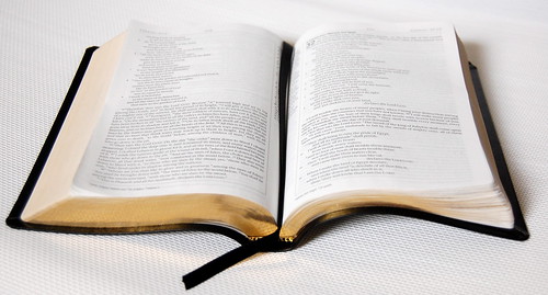
Above: Pulling the pages apart. On the left, you see the properly separated pages. On the right, they're still stuck together. It's a pain to pull them apart one by one, but it makes a big difference.
The more time I spent with the Personal Reference, the more I liked it. There’s no question that, when reading, a paragraphed text flows better than a verse-per-line text. And reading a single-column paragraph is more natural that a narrow double-column setting.
You can find experts to say almost anything, but here’s a maxim I think is true: the ideal number of words in a column averages at twelve. If you don’t believe me, pull down a few well-designed books from your shelf and start counting. The Classic Reference columns accommodate an average of six or seven words -- I suspect this is why they look so narrow on the page -- while the Personal Reference seems to average around sixteen. What this suggests is that the double-column Classic Reference columns are about half as wide as they should be for optimum comfort, while the Personal Reference column is a bit wider than it ought to be. (Actually, the width is probably right; it’s the text size that needs to increase. More about that in a moment.)
Your results my vary, but I find the Personal Reference ESV much easier to sit and read for long periods. And that, my friends, is what a single-column setting is all about.
Above: The TruTone is quite flexible, and as you can see in the photo, the poetry has plenty of room on the page -- no more awkward forced line-breaks!
But if you want to know where this edition really shines, take a look at the poetry. In the Personal Reference, the poetry of the ESV looks better than ever before. The narrow columns of the Classic Reference (and to a lesser extent the Thinline) absolutely mangle the verse, forcing countless unintended line breaks. Here, they’re all gone. I decided to read one of my favorite passages in Scripture, Job 25-37, out loud from the Personal Reference. The result was pure delight. For the first time, you can see what those lines were meant to look like, where they were intended to break. This factor alone makes the Personal Reference worth owning, if you ask me.
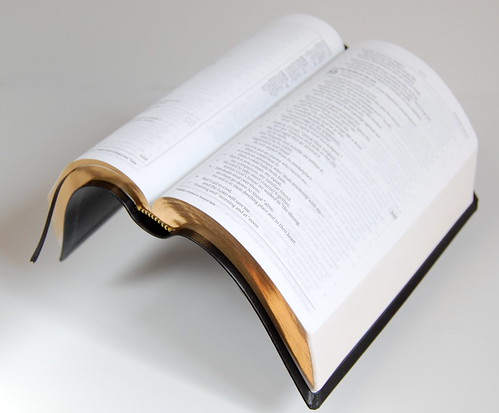
Above: Bible yoga with the TruTone.
Below: Bible yoga with the genuine leather cover.

Above: Unfortunately, the genuine leather pulled a muscle doing exercise. I had to give it a chiropractic adjustment to restore alignment. Also, when coiled up, the genuine leather was the first Bible I've twisted up that untwisted itself. That cover wants to stay stiff!
A STROKE OF GENIUS
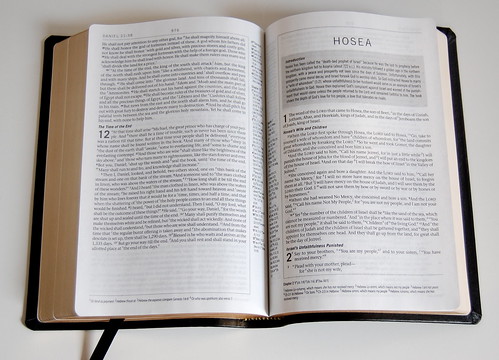
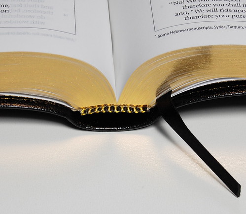
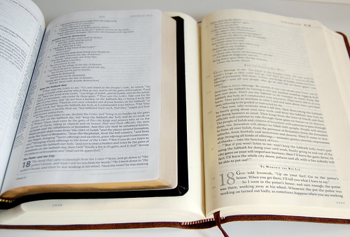
Single-column settings are relatively rare, but hardly unknown. A single-column with references, though, is quite unique. After all, when you only have one block of text on the page, there is no center column to stash the references in. Where do you put them? The outside margin would be the obvious place, but Crossway chose the other option. They moved the references to the inside margin. This is a stroke of genius.
To understand why, you have to remember that one of the drawbacks of so many inexpensive Bibles (and more than a few expensive ones, too) is the designer’s urge to cram as many words as possible onto the page. This results in text columns being too wide, which means that the inside edge of the biblical text sometimes curves down into the spine, where it is obscured and in some cases nearly unreadable. By putting the references on the inside margin, Crossway created a buffer between the spine and the biblical text. This means that when you open the Personal Reference, the entire text column is fully visible. The references curve into the spine, not Scripture.
Above: In The Message Remix (left), the biblical text creeps into the spine, but the Personal Reference layout results in the text column being fully visible.
If you use the references constantly, you might find yourself wishing a great allowance had been made on the inner margin. But this is first and foremost a Bible for reading, and the inner column placement serves to de-emphasize the references. If you need them, they’re always there -- but they don’t detract from the text.
QUALITY IMPROVEMENTS
Crossway has chosen not to make a quality binding of the Personal Reference ESV available at this point, which means the top end of the spectrum is the genuine leather edition. I can only speculate about the reasoning behind the decision. Maybe they’re worried that the Personal Reference won’t catch on, and they don’t want to end up with a crate of single-column ESVs in cordovan calfskin sitting in the warehouse. That makes sense, if you think about it. The average consumer probably doesn’t notice whether the text is single- or double-column. They might think certain translations are hard to read and others easy, without ever making a connection between readability and design. And those who do notice tend to be very particular, so there’s always a chance that even a single-column, paragraphed text won’t please demanding people like me. Why take a chance on wasting all that calfskin?
Above: The genuine leather edition is has a stitched binding, as you can see above. Note the way the pages are gathered into signatures at the spine, and the dimpled paper in the crease where the stitches are.
Fortunately, though, there are some improvements evident in the existing editions. The most obvious one, of course, is the fact that the genuine leather edition features a sewn binding. This means that the pages are folded over into little booklets called signatures and then the signatures are stitched together. The individual page -- say page 993 -- is actually one of four pages that are printed together on a single sheet, then folded. What’s the advantage of this? For one thing, the pages don’t fall out with heavy use the way adhesive bindings do. For another, a sewn binding has the potential to be more flexible in the hand.
If you’re going to have a Personal Reference ESV rebound with quality leather, you have to start with the sewn edition. Rebinding a glued one, though possible, will result in a much stiffer binding because of the way it will have to be stitched.
Above: In contrast, the TruTone has a glued binding. No visible signatures, no dimpled pages. So the stiff binding is mated to a flexible cover, the flexible binding to a stiff cover. I begin to feel like the Tantalus of Bibles -- perfection always just out of reach.
Another improvement in these editions is the paper quality. It appears to be more opaque than in the past. Though there is still bleed-through -- imprinting from other pages visible through the paper -- it doesn’t seem to be as pronounced. I’m happy with the change, though it isn’t so dramatic that I would have noticed had it not been pointed out. My guess is that people sensitive to bleed-through will still find it a problem.
A WORM IN THE APPLE?
Of course, all is not perfect. In some respects, the early feedback on the Personal Reference ESV reminds me of the reception of the Journaling Bible. People like the concept but aren’t happy with the execution. In both cases, the culprit is the same: the type size is simply too small.
The Personal Reference ESV is set in 7.4 pt type, larger than the Journaling Bible but still pretty small. Alongside other editions with similar proportions, the type size is comparable -- but most small editions of Scripture are double-columned, which means they can accommodate smaller type. When you use small type in a single-column setting, you have to shrink the page size accordingly. In this case, the type is just too small for the page’s other proportions.
Above: Compared to the larger Numbered Edition of The Message, the Personal Reference has small, less readable type. The ratio of type size to line width in The Message is right, but the Personal Reference has too many words on the line for its 7.4 pt type.
Remember that maxim I invoked earlier about the optimum column width being about twelve words, give or take? The Personal Reference exceeds this limit by enough margin to be noticeable, and as a result the column looks too wide and the type looks too small. Most of the early criticism I’ve heard centers on this problem of proportion. The easiest solution would be to increase the type size -- but there’s a right way and wrong way to go about it. If you simply enlarged the layout the way you can enlarge a photograph, the type would be bigger, but the proportions would still be wrong. Ideally, the type size should be increased without changing the width of the column itself. Right now it measures about 3.6 inches, and that shouldn’t change. Instead, the font size should bump up from 7.4 to somewhere in the region of 9 or 10 pt.
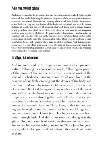
To illustrate this, I created a not-quite-perfect example. My mock-up shows a column of 7.4 pt type set 3.6 inches wide, compared to a column of 10 pt type at the same width. Since I don’t have the font the Personal Reference ESV is set in, this is far from exact, but I think you can see the principle I’m trying to illustrate. Given the width of the column, and assuming the font proportions are similar, increasing the size from 7.4 pt to 10 pt results in averages much closer to the twelve-word ideal width. The lower column is more readable because of the increased type size, but also because the line widths are better suited to the size of the text.
If you’re wondering what the ideal width for a column of 7.4 pt text might be, I did a little experimenting and came up with 2.75 inches, give or take. This can only be an approximate guess, though, since typefaces vary significantly. The point is, there ought to be a balance between the size of the type and the width of the column. The font used in the Personal Reference ESV needs to be at about 9 or 10 pt to balance the 3.6 inch column width. (The larger type would also address the perception some have that the imprinting is too light.)
Of course, my example demonstrates the problem with that: larger type takes up more space, and that means a thicker book. Personally, I would have made the trade-off. Even if the Personal Reference ended up at 1.5 or 1.75 inches thick, it would remain quite handy. But I can understand the reluctance to take the chance.
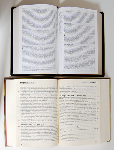
Above: The Message Remix hardback has larger type and a more readable ratio of type size to line width.
Below: But there's a trade-off. The Message Remix is almost twice the width of the Personal Reference ESV.
The result, though, is that the Personal Reference reads well, but not as well as it could, and for readers who don’t want to adapt to the small type, it just won’t be an appealing option.
Still, I don’t want to exaggerate the issue. Compared to two popular single-column settings -- The Message Remix hardback and The Message Numbered Edition -- I think the Personal Reference holds its own. I prefer the font choice for the ESV and like the white paper better than the cream. The Message features larger type, and therefore edges out the Personal Reference on ease of reading, but the form factor of the Personal Reference is more compact.
OTHER DRUTHERS
Right-sizing the type is the main thing I’d do, but there are a few other things I’d like to see offered with the Personal Reference ESV. Now that I’m hooked on Crossway’s excellent Daily Reading Bible plan, I would appreciate this hand-sized edition coming with three ribbons to mark the readings. Now that there’s a single-column ESV, I’m making it my daily reading edition, but it’s a pain to have to use other bookmarks to follow the plan.
While I’m at it, I’d love to see the Daily Reading Bible notations, which indicate which sections to read on which days, added to the margins of the Personal Reference. That would make this the ultimate reader’s edition.
Above: The Personal Reference offers a good compromise between size and usability. It's a good Bible to take with you on the go.
Apart from those changes, the only thing I’d like to change is the binding options. The Personal Reference is just crying out for a cordovan calfskin cover. And who wouldn’t want an Allan’s edition of this thing? For everyday use and abuse, the TruTone cover feels better than the genuine leather, but it’s hard to recommend a glued binding over a sewn one. I wonder if I could pull off a genuine leather cover and affix a TruTone in its place? Not a bad idea, until something better comes along.
THE SHOCK OF THE NEW
No question, the Personal Reference ESV is going to take some getting used to. If you’re accustomed to the traditional two-column layout, this will be a bit of a shock. My advice is to immerse yourself into the text. Just start reading. You might be surprised how much you like the single-column approach once the novelty fades.
If you have trouble with small type, though, I’m not sure what to tell you. This is a relatively compact Bible with very compact type -- a deal-breaker for many, I know.
Hopefully, though, the challenge of the small type won’t be blamed on single-column settings in general. My fear is that, because the Personal Reference isn’t perfect, it won’t gain the acceptance it should, and as a result people will assume there just isn’t enough demand for this kind of layout. 7.4 pt type is too small for some eyes, no matter how it is formatted.
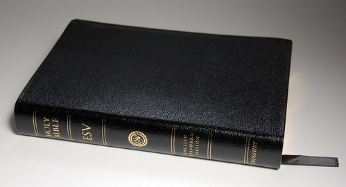
Above: The genuine leather edition.
SUMMING UP
I love the Personal Reference ESV, but I understand if not everyone does. For me it delivers most of the goods -- a readable, single-column setting with a clever approach to references and a relatively compact form factor. I’ve never enjoyed reading the poetry of the ESV more, and it’s never looked so good on the page before. All in all, I’m satisfied. Having said that, what I’m waiting on is a quality binding for the Personal Reference. It’s hard to commit fully until then.
My advice is to pick up a copy and see for yourself. Don’t just flip through it and make a decision. Spend some time reading. If you don’t like it after that, so be it. But like me, you might find that after a few hours reading, you don’t want to part with it.